Other Half Brewing
Other Half is a leading craft brewery with eight locations across the Northeast, known for IPAs, stouts, lagers, and experimental styles. As part of a small in-house design team, I support company-wide initiatives—from beer labels and brand activations to merch, digital content, and events. Lately, we've focused on making the brand more cohesive, supporting a major marketing push through social campaigns, festivals, and taproom experiences.
Beer Label Design
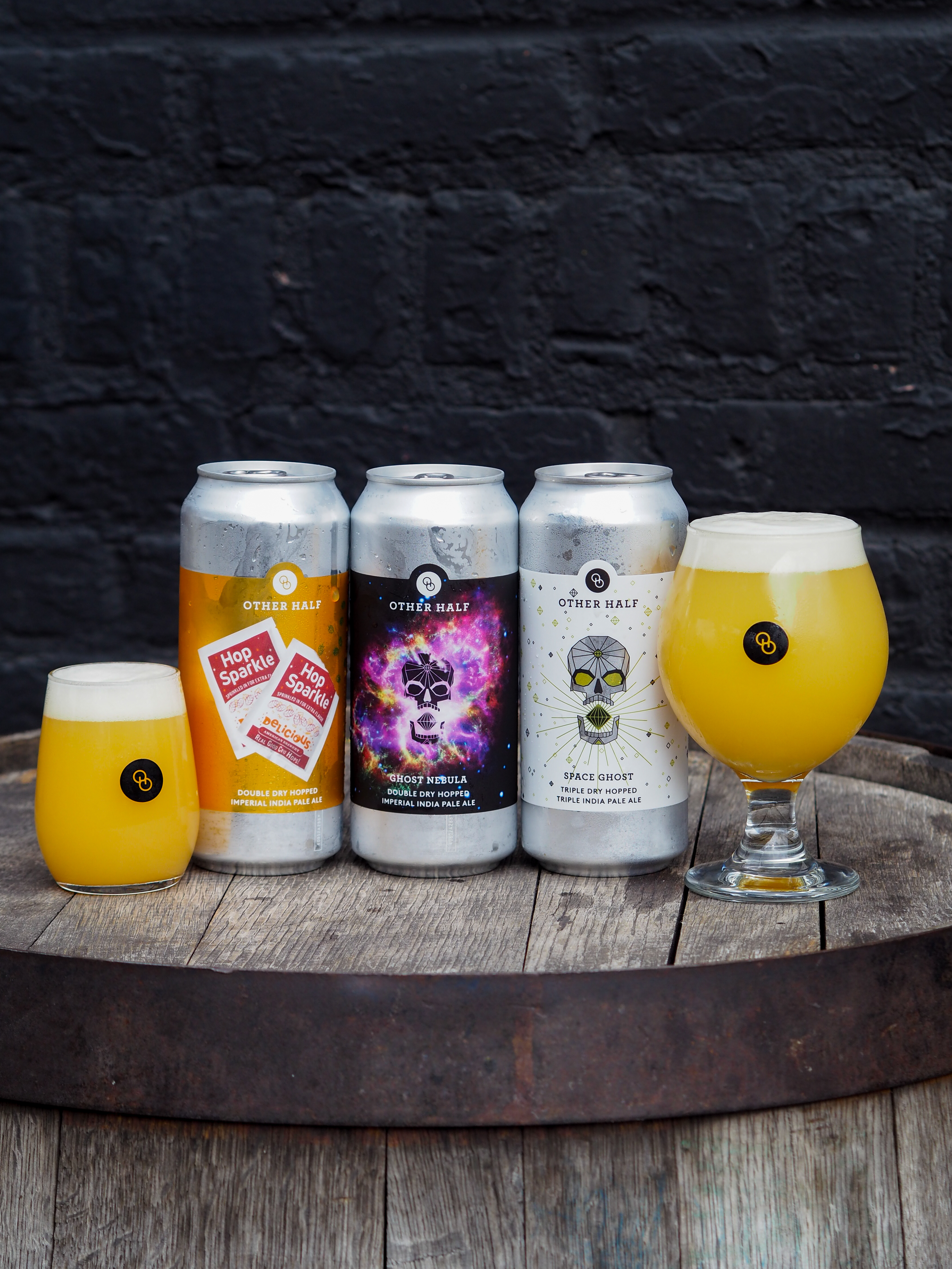
I worked on designing and refining beer labels for Other Half, blending new concepts with updates to existing designs. As part of a brand audit, we honed in on a consistent style, color palette, and design elements so labels stand out on the shelf as unmistakably Other Half.
Most feature bold, vibrant colors on metallic paper, with exceptions like the white-backed Triple Dry Hopped series. Some designs also nod to specific inspirations, like the Domino Park labels referencing Domino Sugar packaging.
Most feature bold, vibrant colors on metallic paper, with exceptions like the white-backed Triple Dry Hopped series. Some designs also nod to specific inspirations, like the Domino Park labels referencing Domino Sugar packaging.



Taprooms across 8 locations
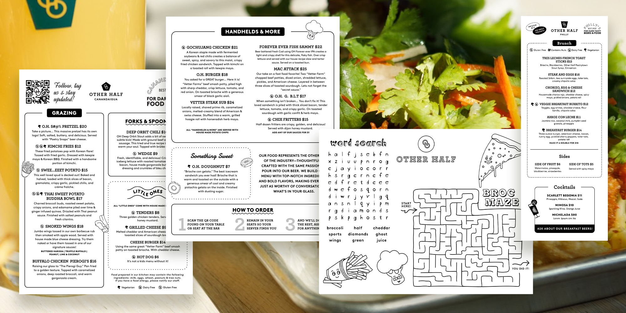
Other Half has eight taprooms across the Northeast. I design collateral to support beer weeks, festivals, merch promos, events, and taproom menus—helping everything feel connected and on-brand. I developed a visual language for the menus used at the taprooms.
11th Anniversary
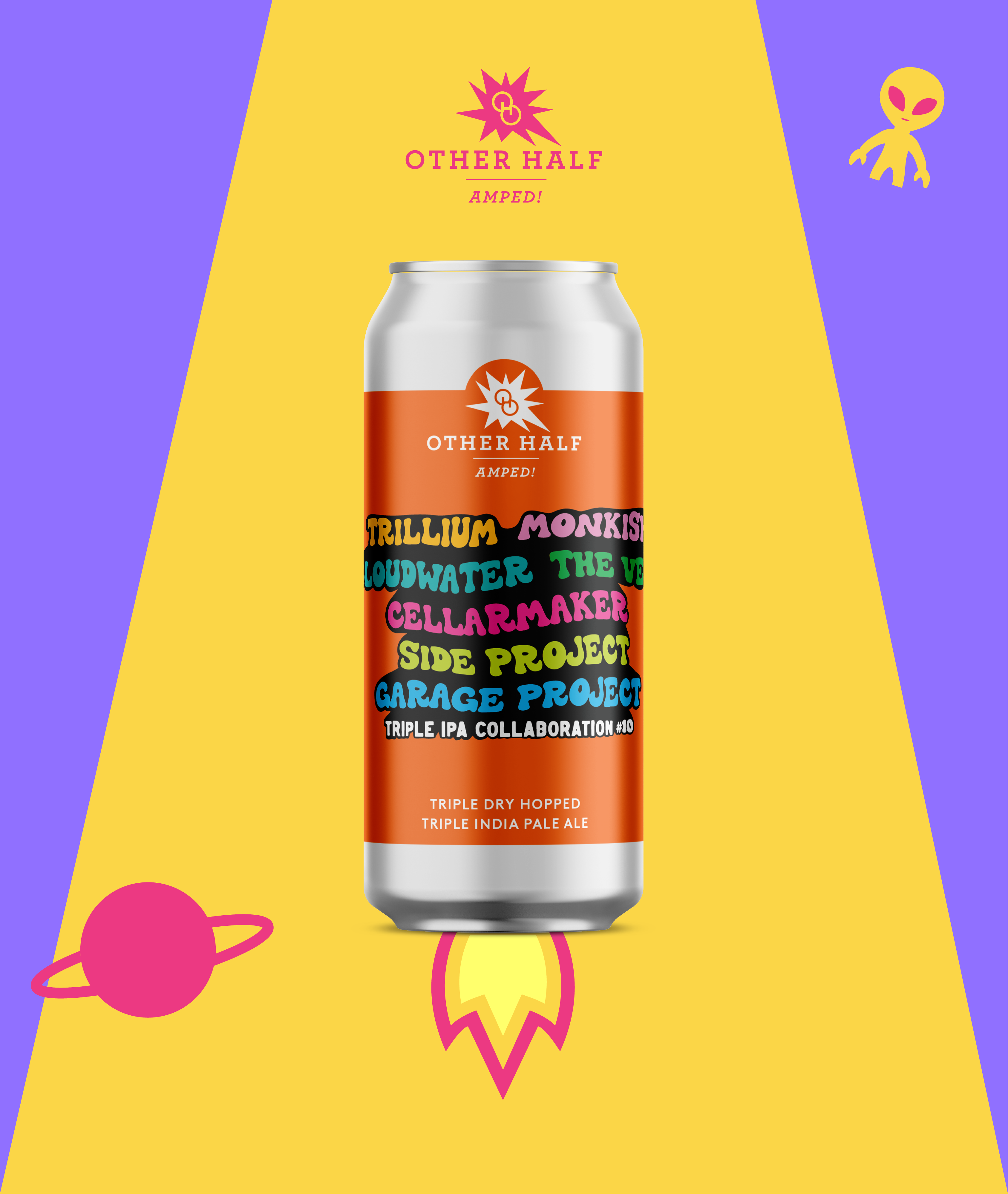
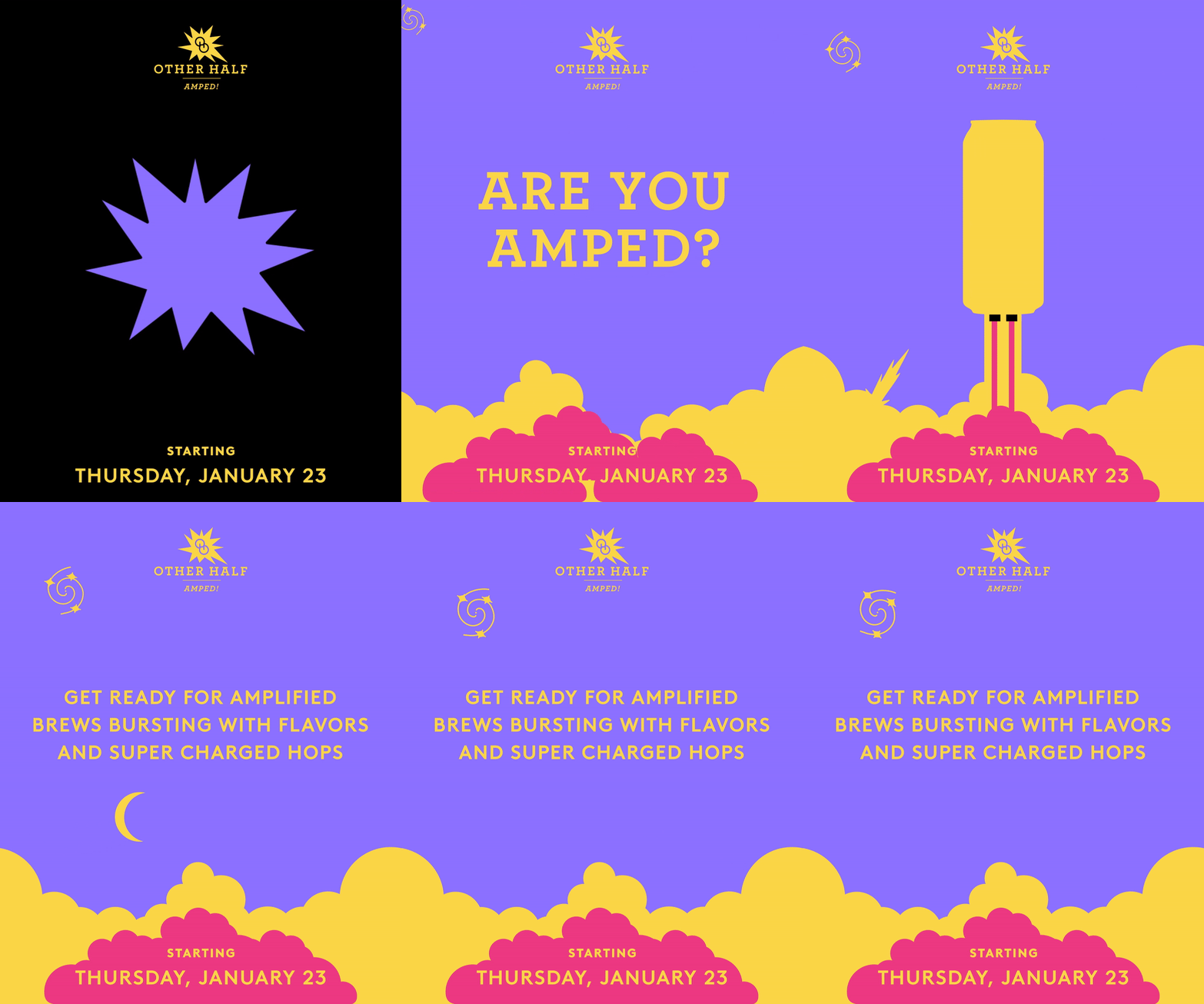
February 2025To boost winter sales and navigate Dry January, we ran a three-week campaign—Amped! Week, Collab Week, and 11th Anniversary Week—blending product launches, social engagement, and a finale event.
Amped! Week set the tone with an supercharged theme and a bold yellow carried through all three weeks. The challenge was keeping momentum while tying everything together. By collaborating with breweries, building templates for outside content, and creating eye-catching visuals, merch, and event materials, we kept people excited, increased taproom traffic, and built hype around our seasonal beers
Amped! Week set the tone with an supercharged theme and a bold yellow carried through all three weeks. The challenge was keeping momentum while tying everything together. By collaborating with breweries, building templates for outside content, and creating eye-catching visuals, merch, and event materials, we kept people excited, increased taproom traffic, and built hype around our seasonal beers




Green City Festival
June 2024
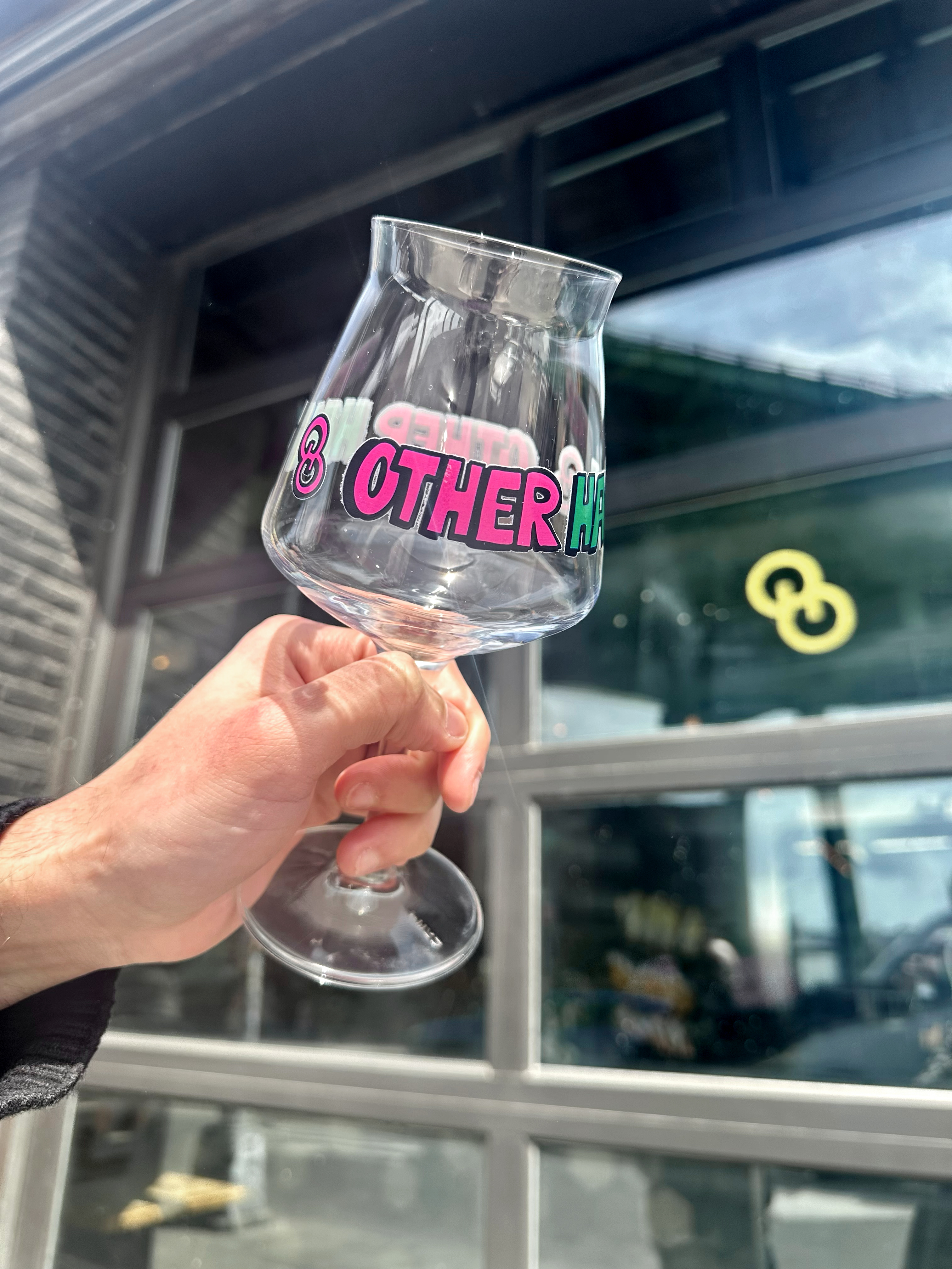
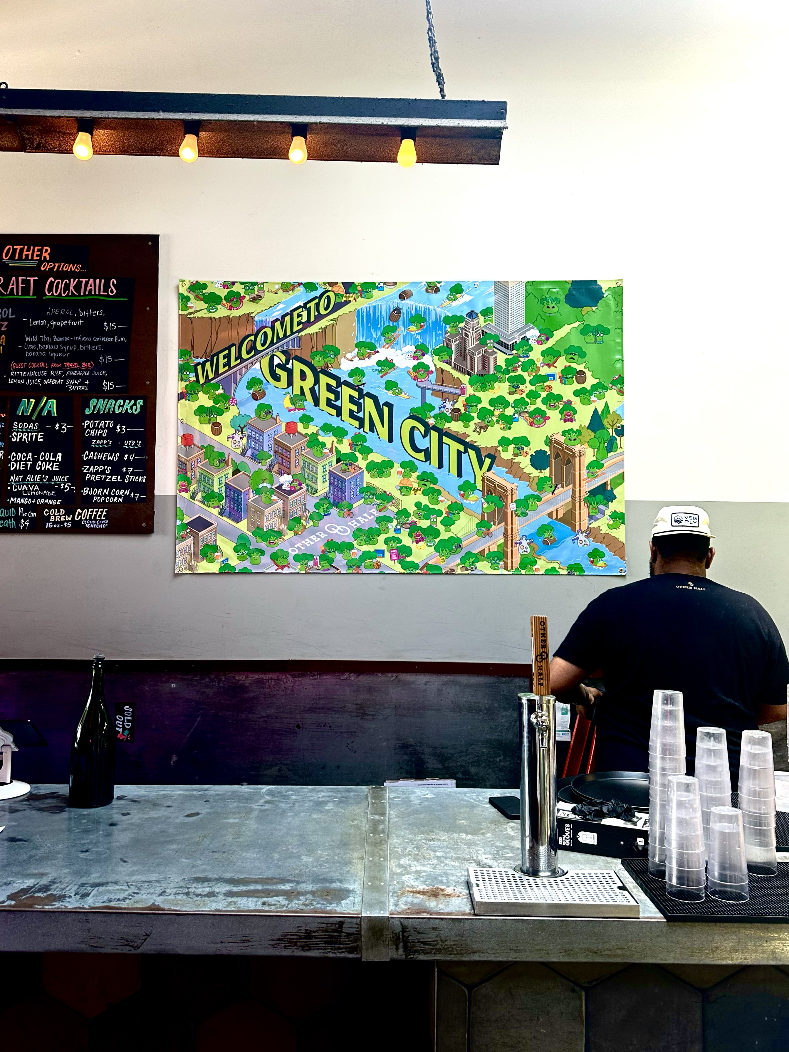
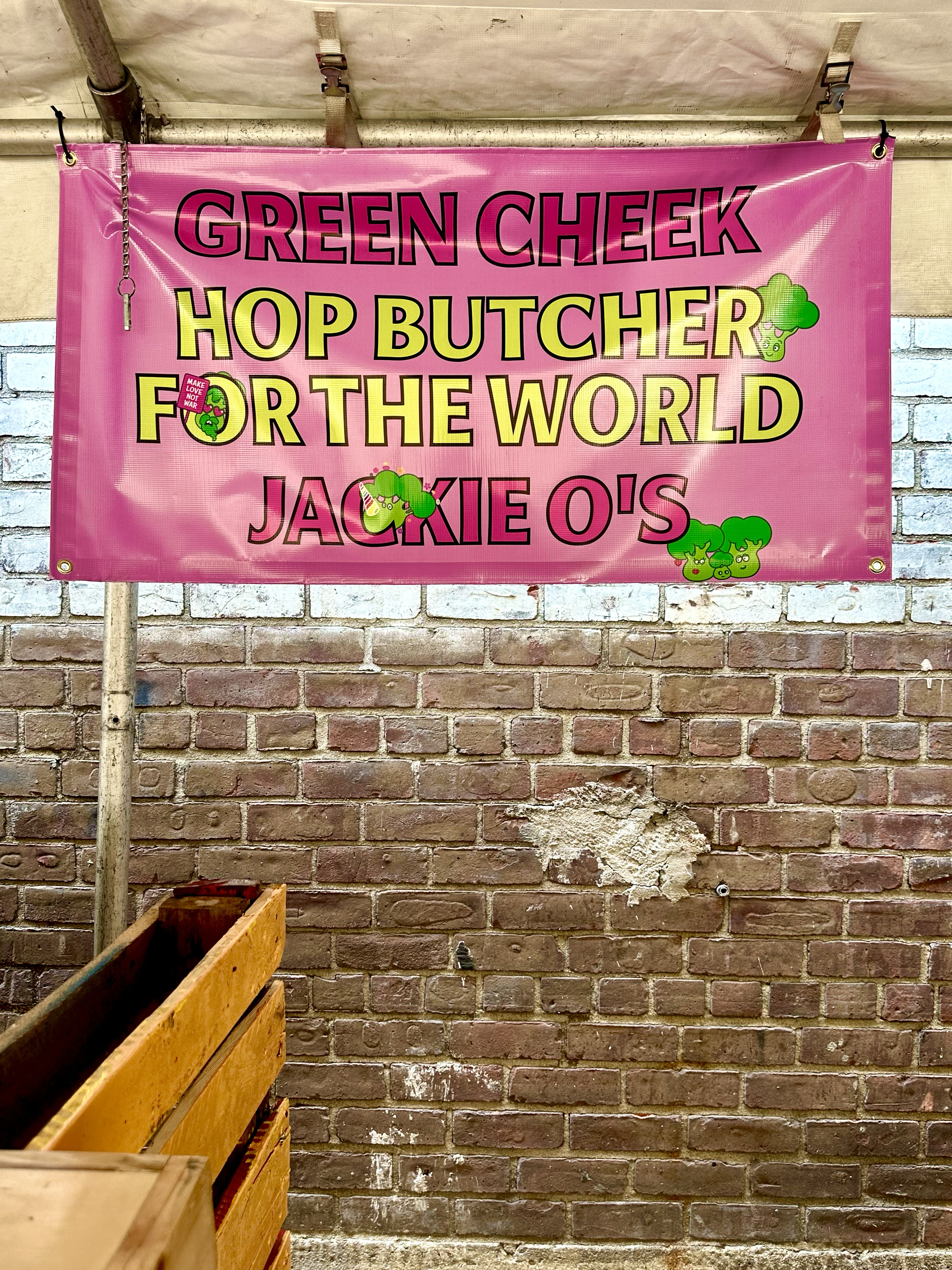
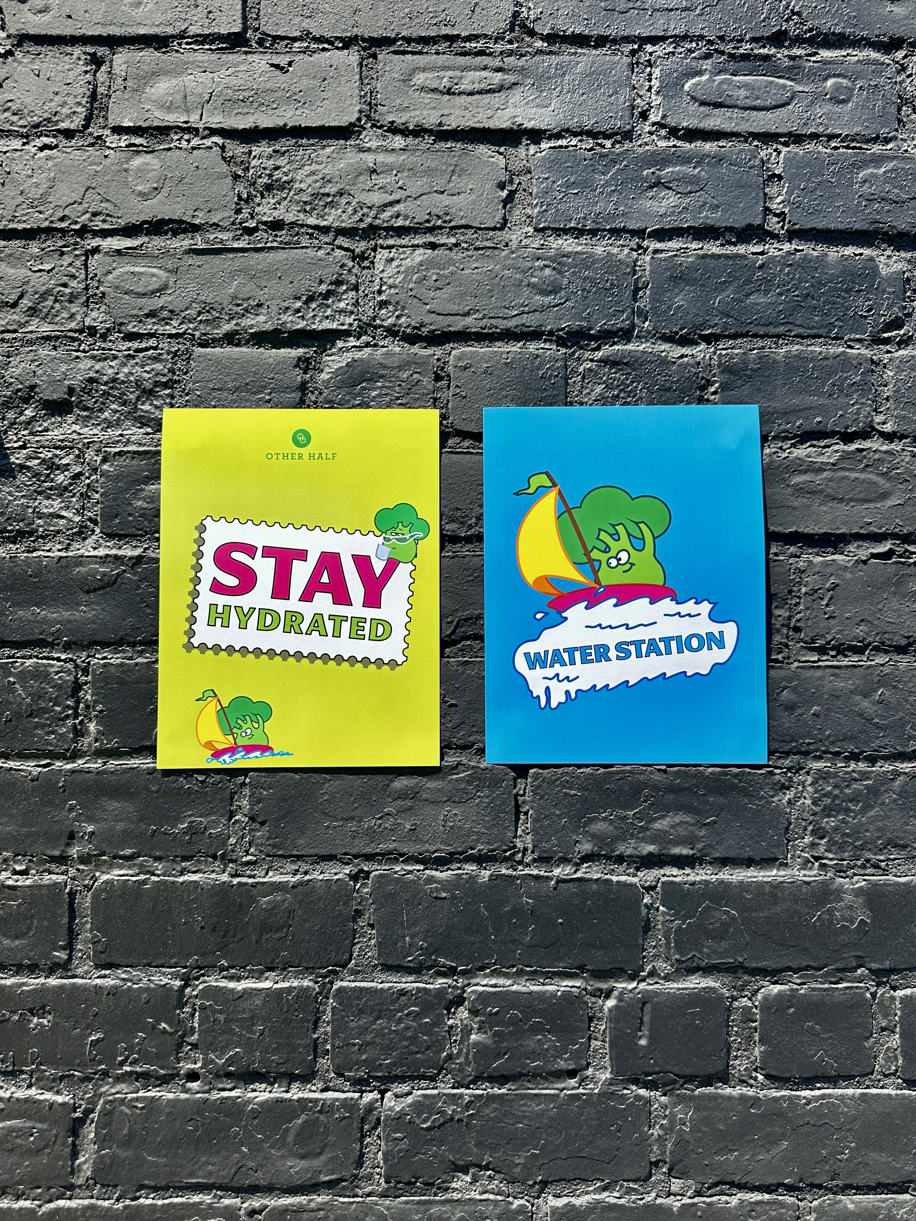
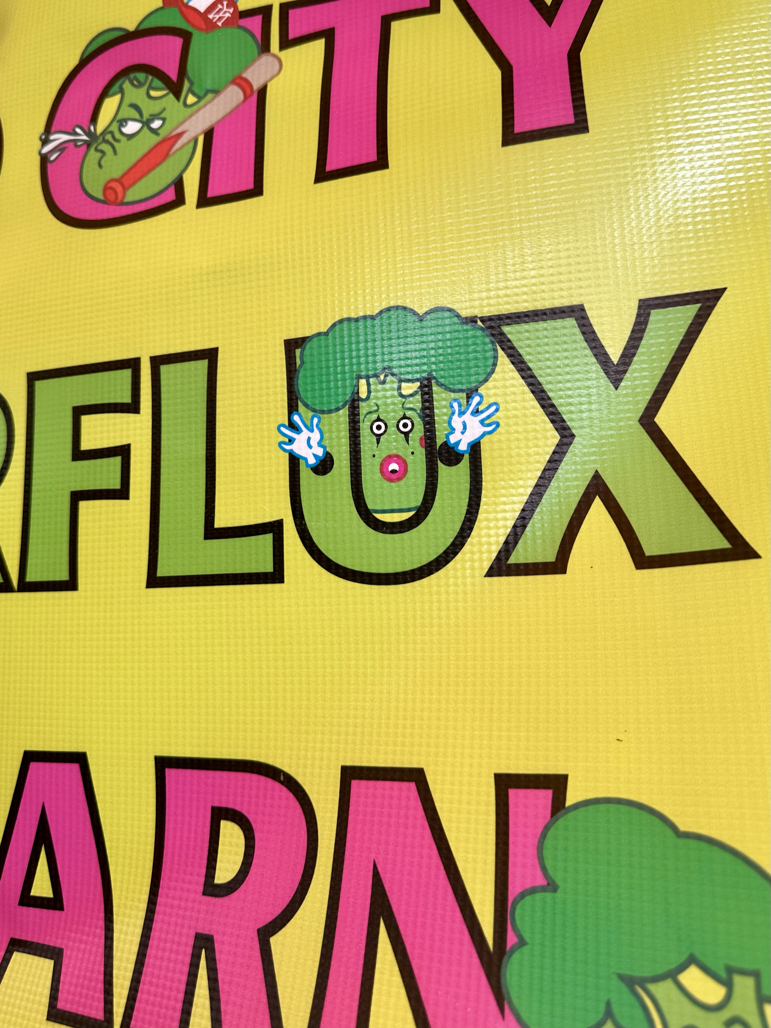
This year’s Green City festival celebrated all the cities Other Half calls home, with illustrated Broccoli Worlds for each. I designed all event materials—print, digital, and promo—integrating brand elements into the artwork. Inspired by Where’s Waldo, we added an interactive taproom element, hiding a custom broccoli character for customers to find.


Stout Season Festival
December 2024
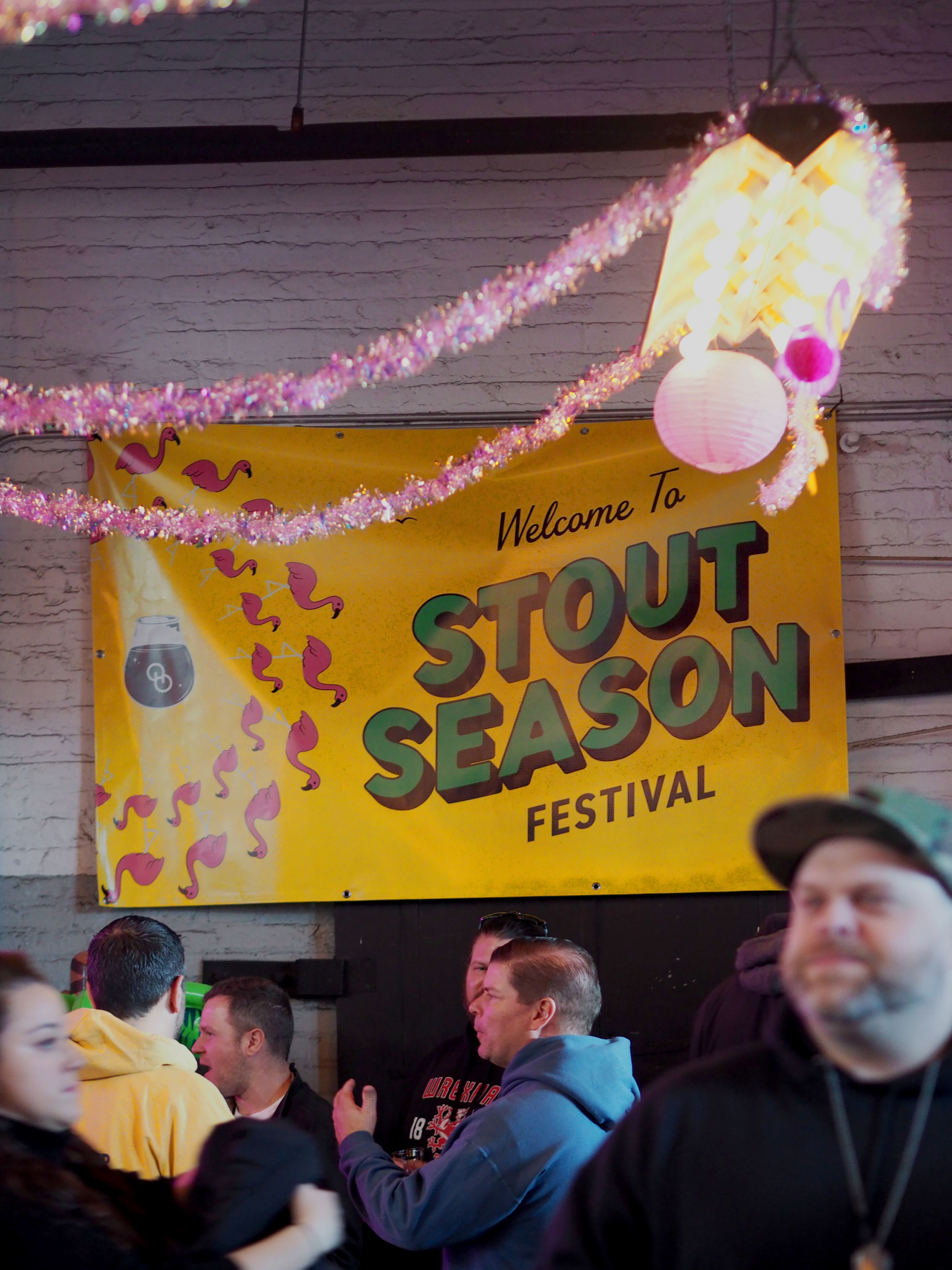
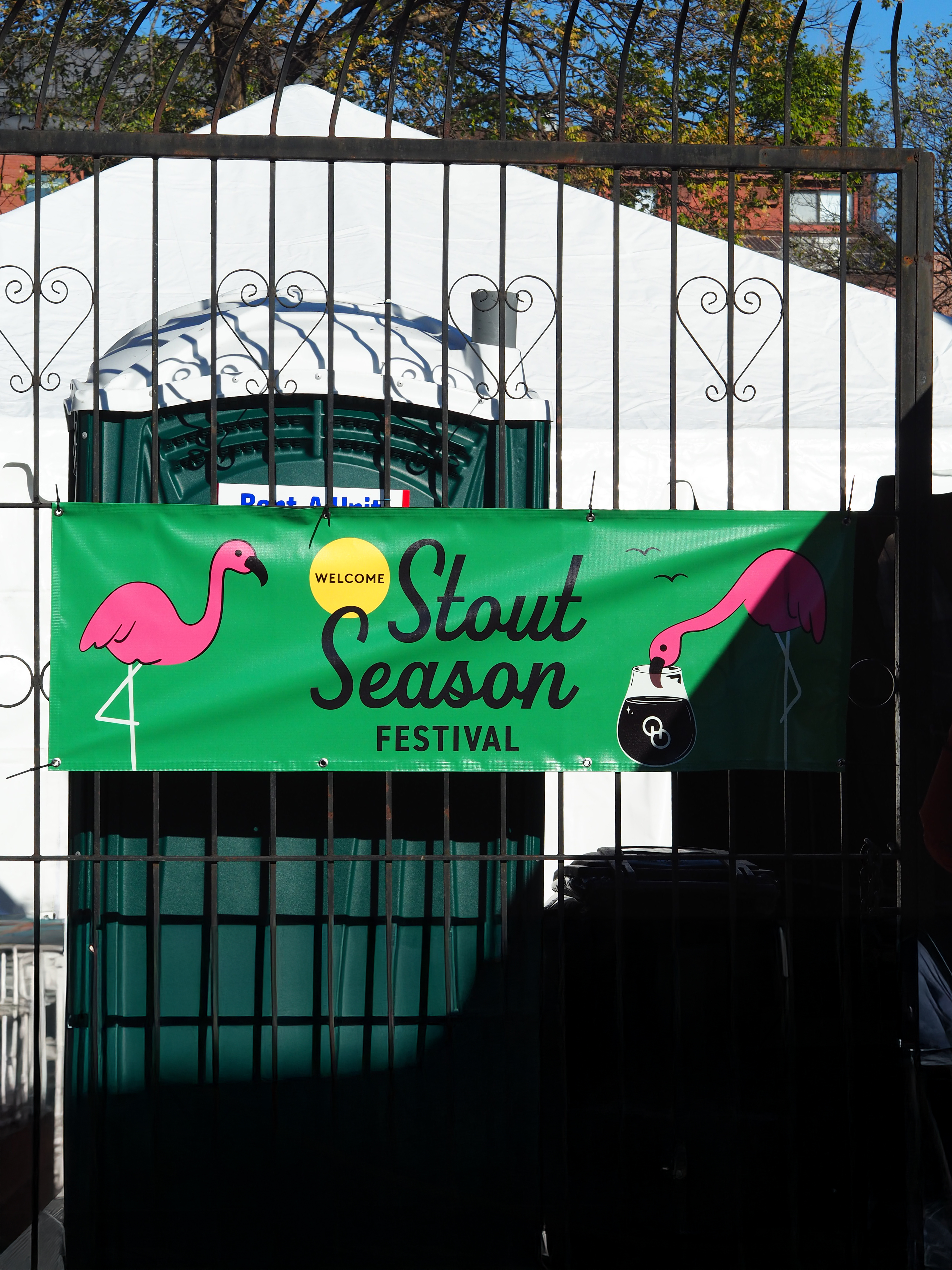
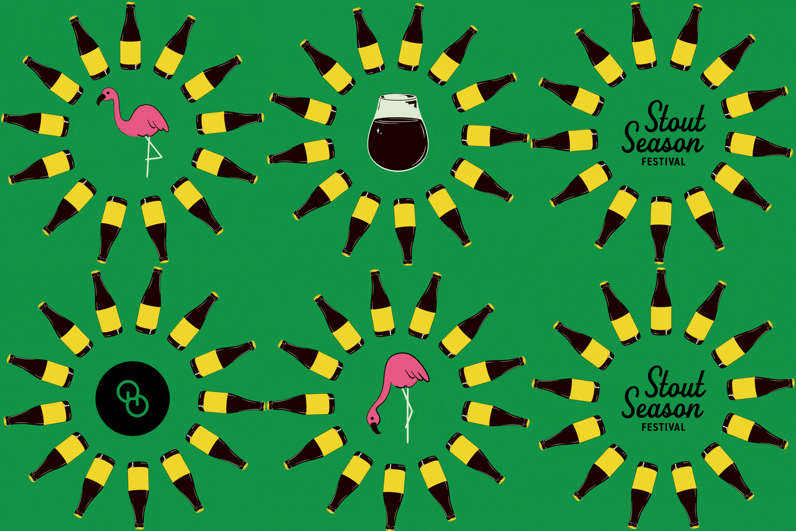
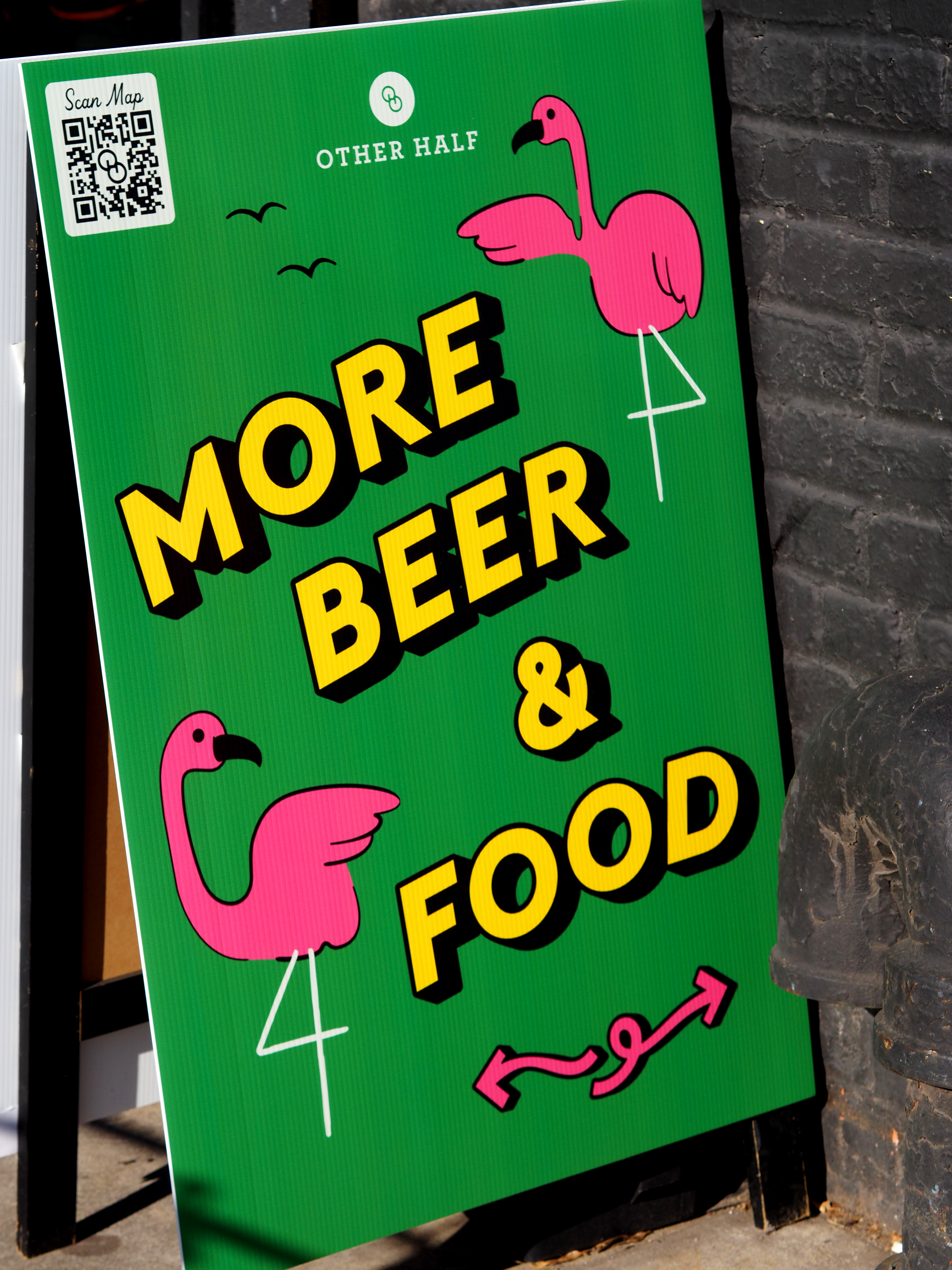
Stout Season is our annual winter festival celebrating pastry stouts, featuring top breweries and collaborators. I expand on existing assets to create a cohesive visual identity across digital and environmental design. Inspired by our Snowbirds stout series and Florida’s retiree culture, the event mascot—flamingos—evolves each year. In 2023, they appeared in snowy scenes; but in 2024, we took a bold, pop art direction.




10th Anniversary
February 2024
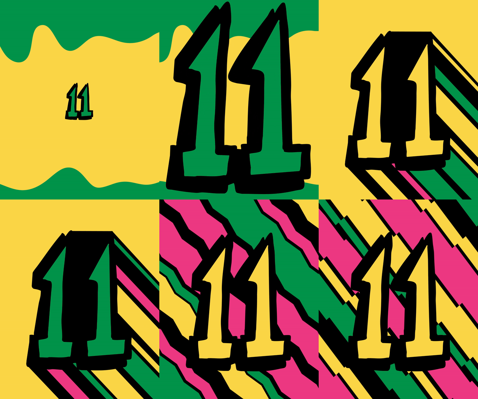
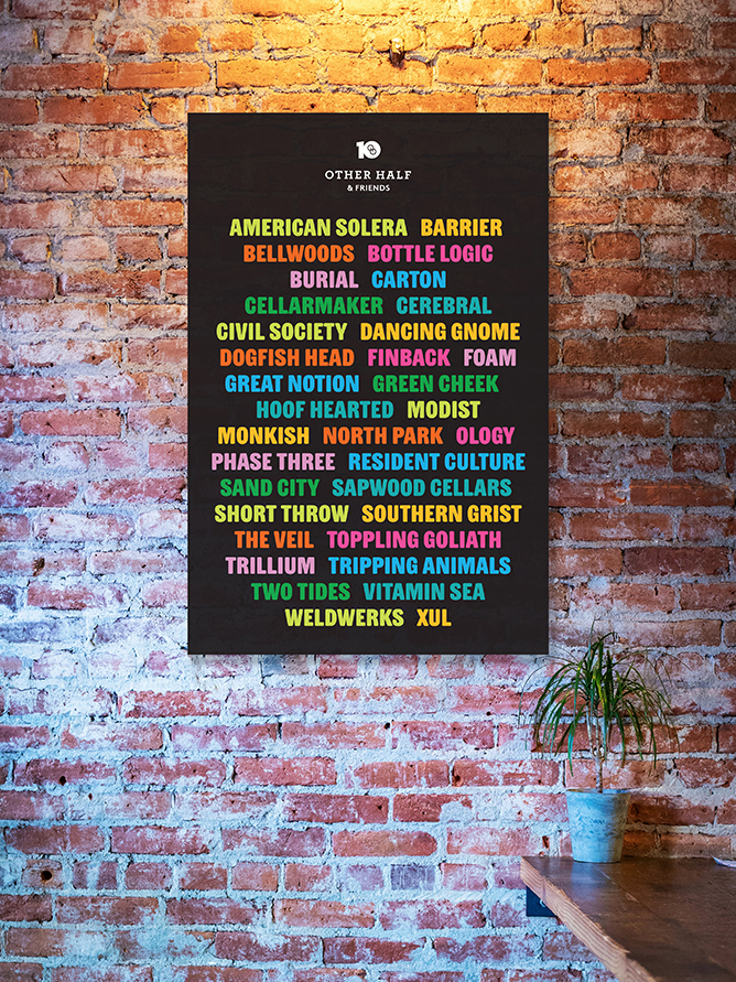
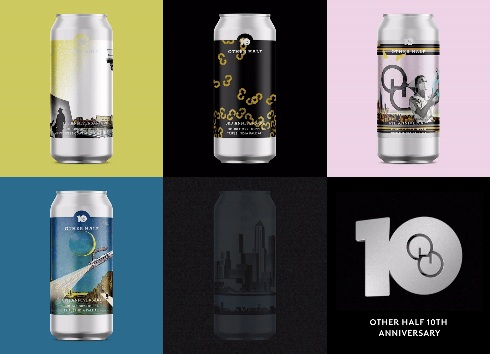
To celebrate this major milestone for the brewery, we re-released all the past anniversary beers over the course of 10 weeks leading up to the big event. In the 10th week, we unveiled a lineup of fresh anniversary beers created specifically for the occasion. This final release was treated as a full-scale festival, featuring a ticketed event where collaborators joined us to pour their beers.



Merch
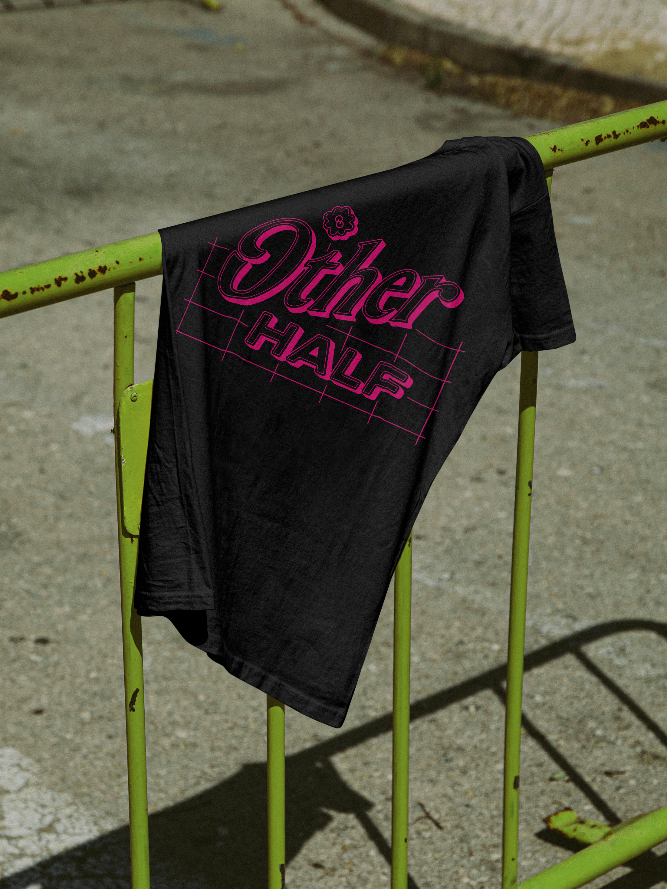
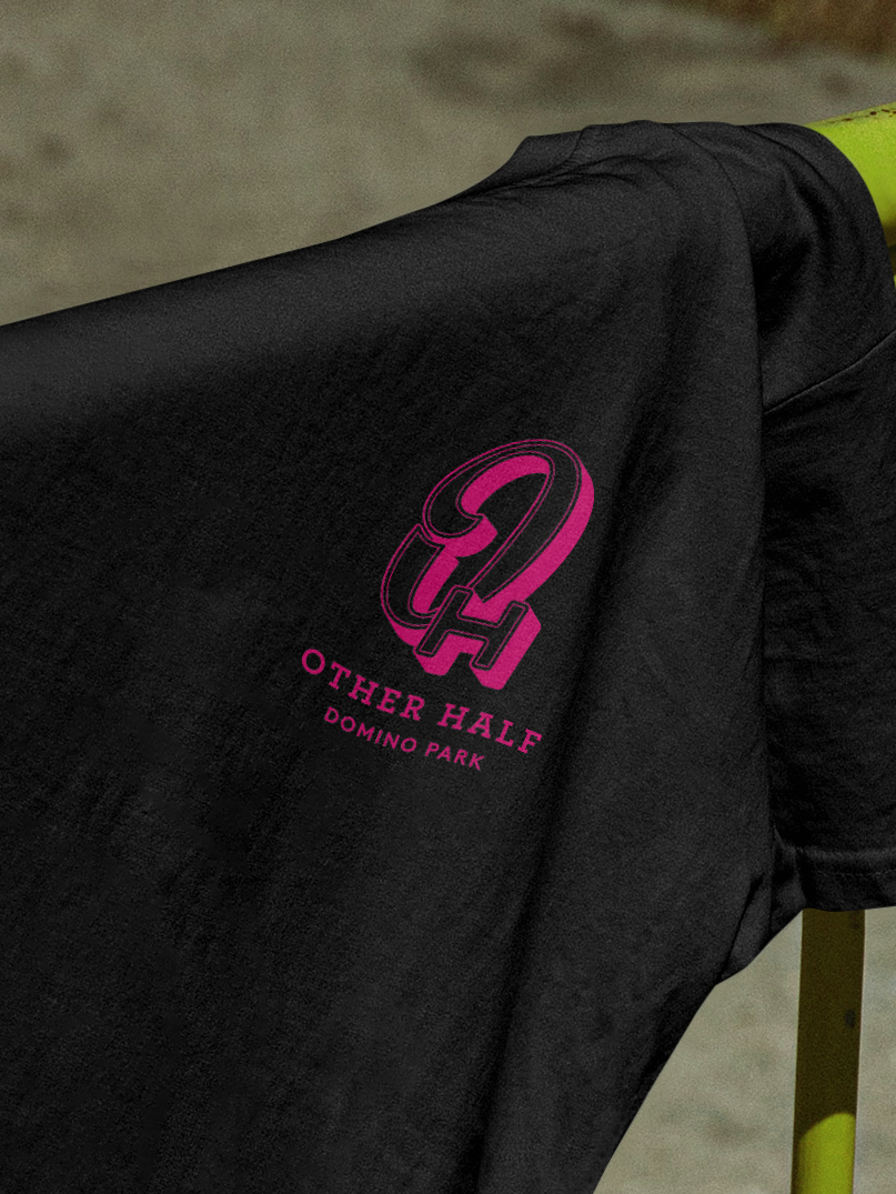
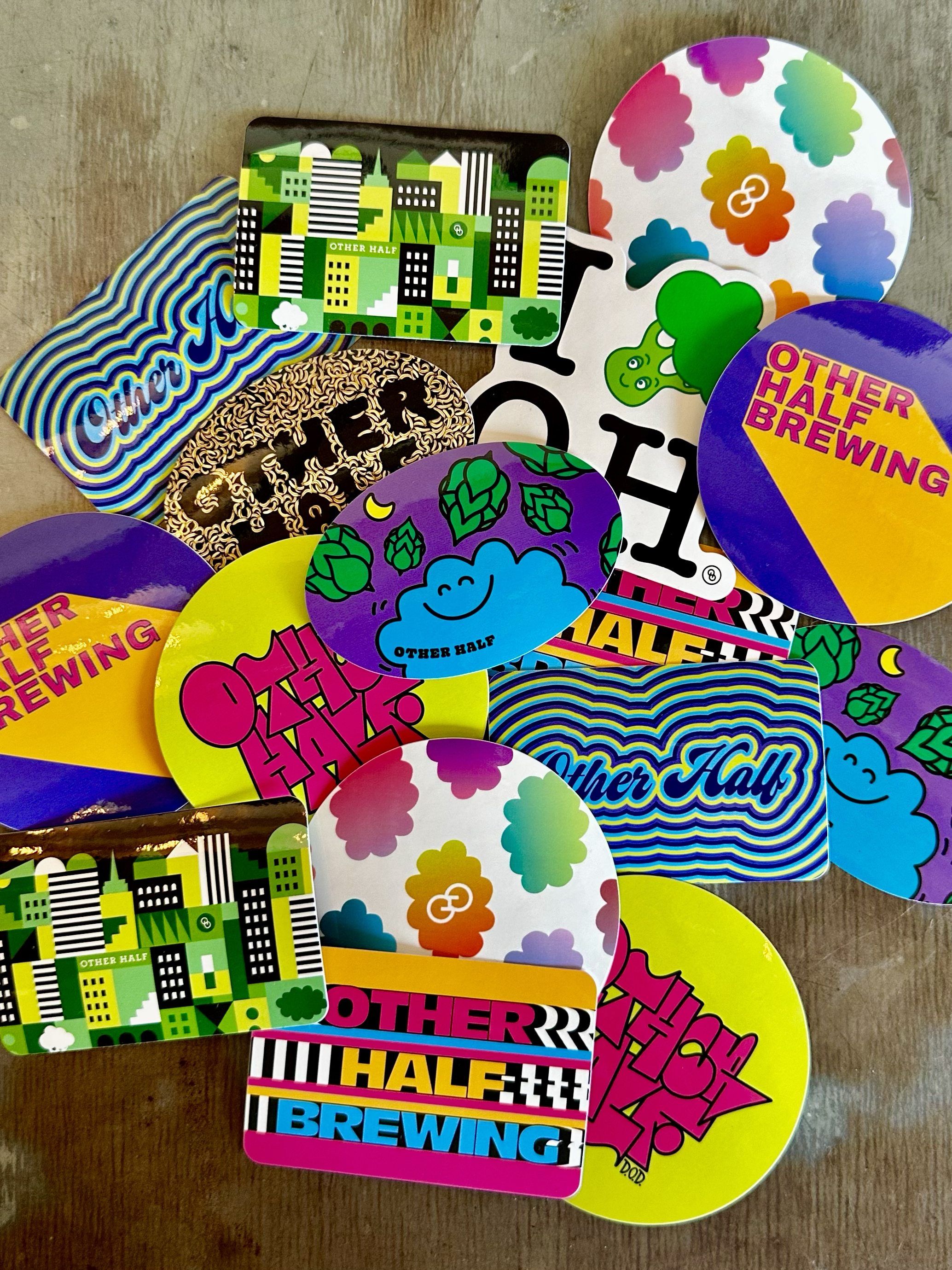
I design merch for Other Half, available both online and in taprooms. This includes apparel, stickers, and other items for events as well as evergreen collections.





Proper Company
Pechakucha Nights, YVN
Pechakucha Nights is a global storytelling platform where speakers present 20 slides that are 20 seconds each about the topic of the night. Coping with Crisis is the 44th Volume’s topic in Yerevan, Armenia.
Vol. 44 Coping with Crisis
Coping with Crisis is about unlocking some of the insights of a generation that has survived a perfect storm of wars, earthquakes, global crisis, and pandemics. The event features a line-up of stories about successes and failures which can inform, embarrass and train the audience.

Yerevan is thriving with cultural events and social activity. After much turmoil in crisis mode.
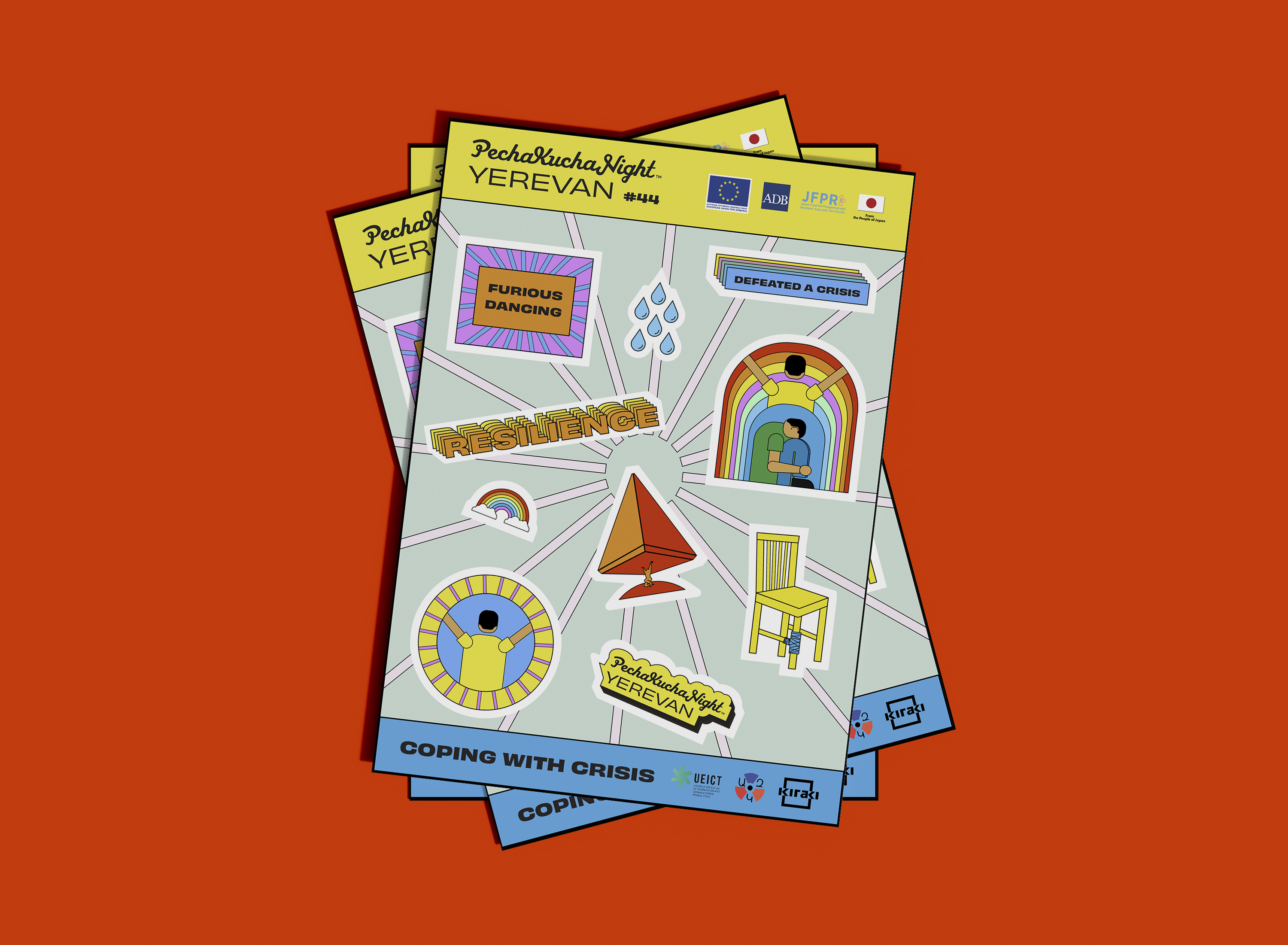
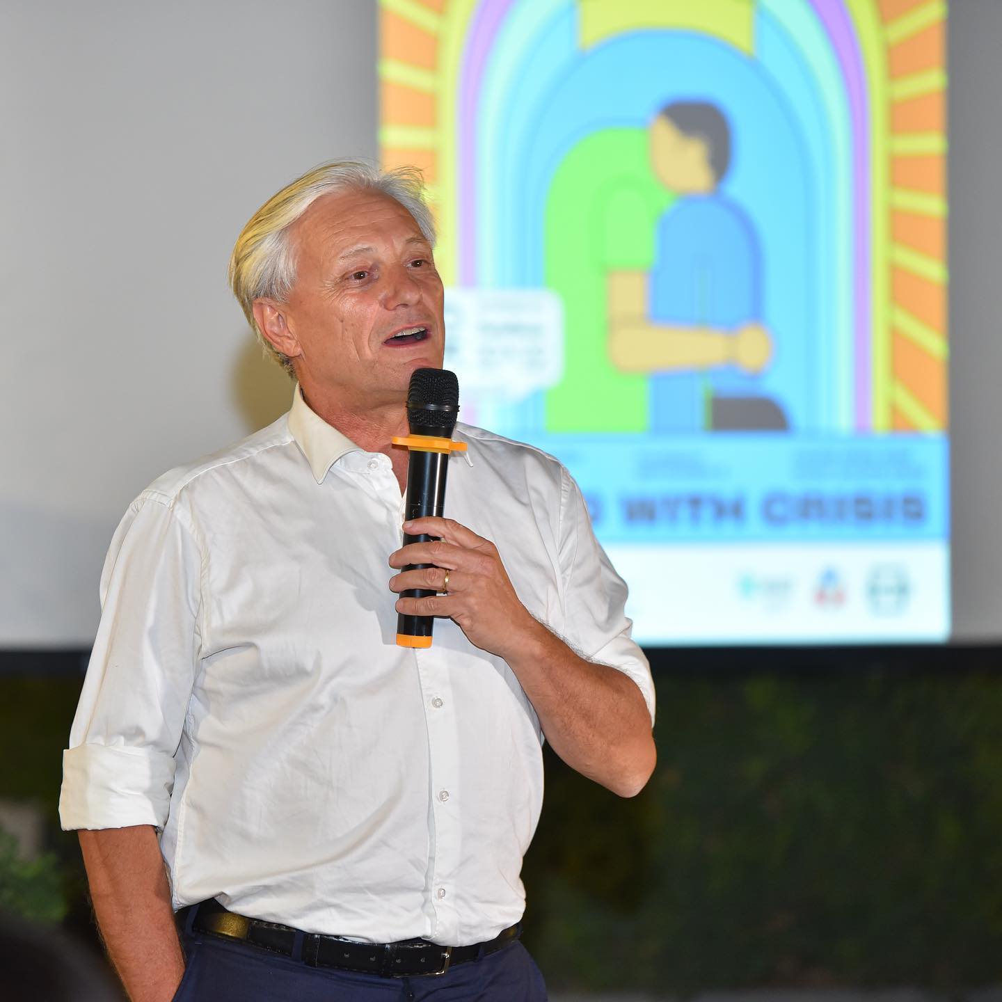
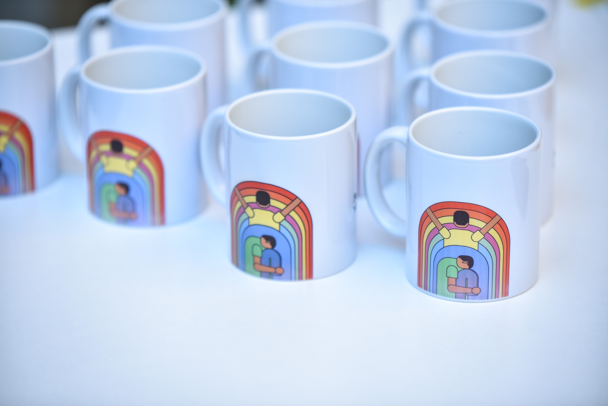
The poster design tells a story of a person who has gone through 2 phases.
First they are sad, angry, maybe lost and disappointed. Which is shown with the person’s sitting positing and the blue + dark green colors.
The poster design tells a story of a person who has gone through 2 phases.
First they are sad, angry, maybe lost and disappointed. Which is shown with the person’s sitting positing and the blue + dark green colors.

But then they find themselves getting out of it with a sense of newness, resilience and hope for the present + future.



Concept Development, Design Direction, and Execution by Maria Badasian
AUA Annual Commencement Booklet Spring 2022
The American University of Armenia Yerevan is accredited by the Western Association of Schools and the University Commission. They opened a few years shortly after Armenia became an independent country to help the next generation grow. They are continuously building new curriculums for the future of the economy.
Using design to reflect the resilience of AUA’s graduating class
This year's concept for the commencement materials, including the booklet, is taking inspiration from 2020’s ceremony that couldn’t happen (due to Covid 19). I worked closely with the AUA’s Communications team to work out a concept and layout designs.
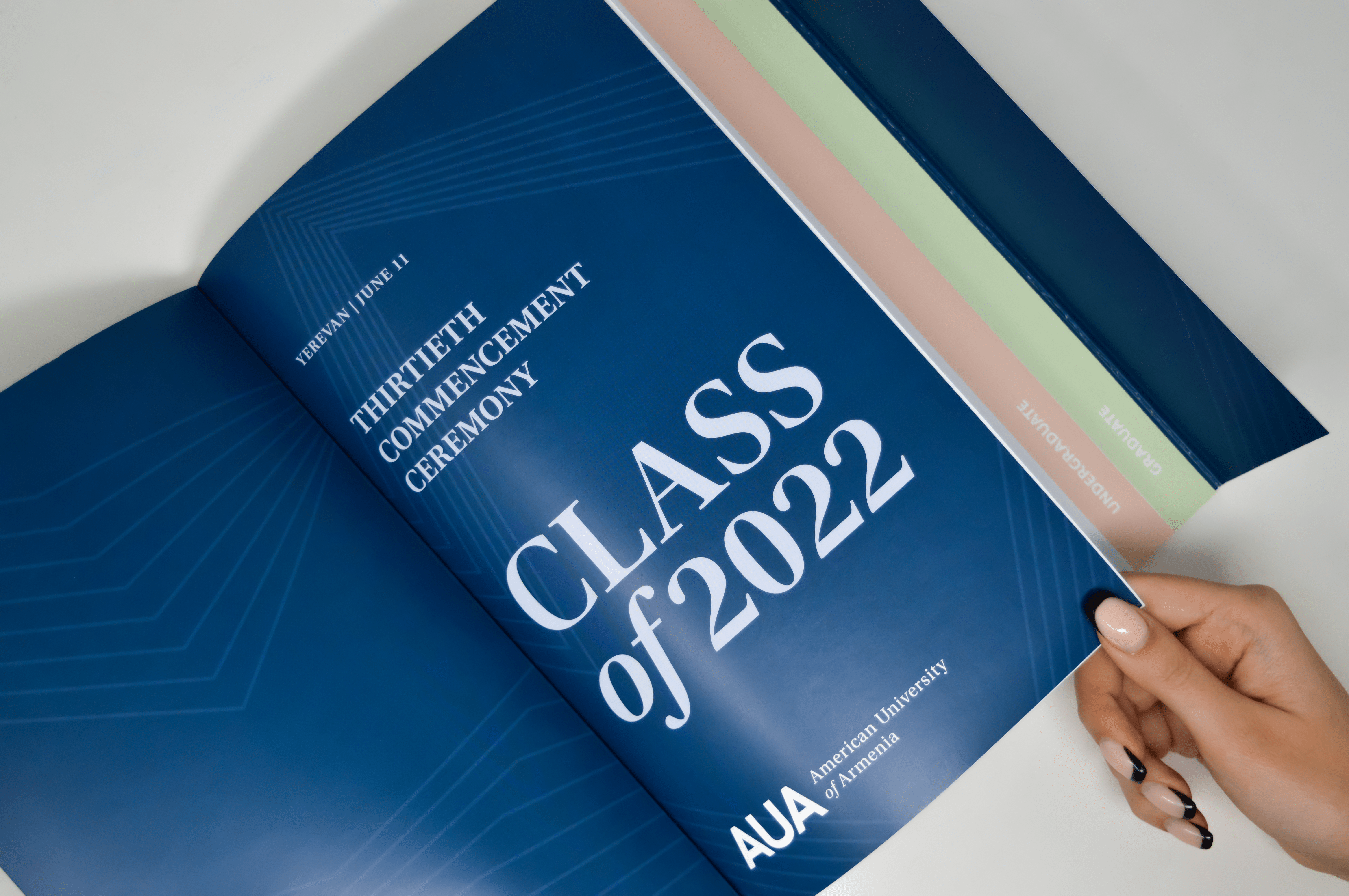
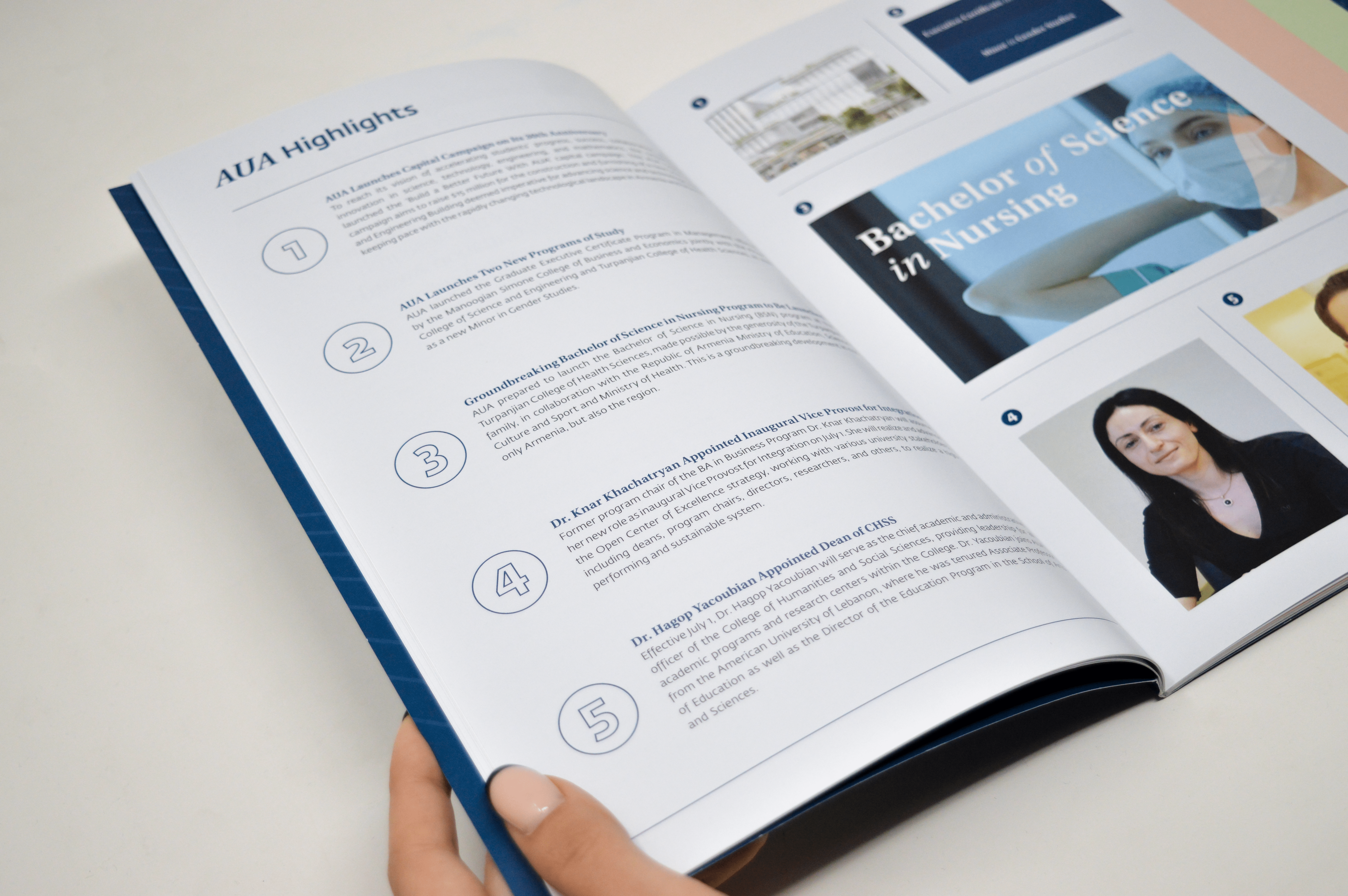
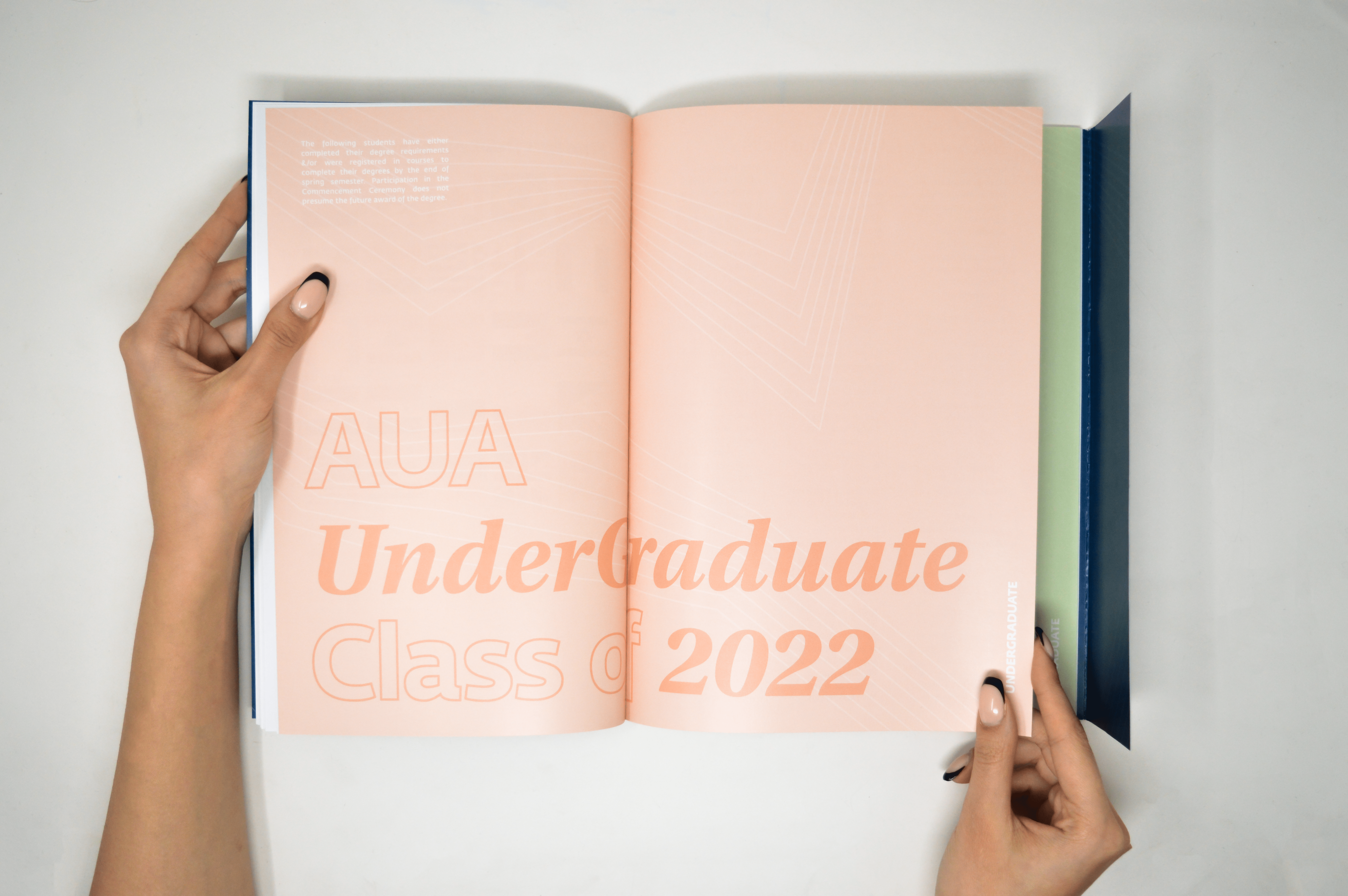
What makes this design unique is the case that envelopes and holds the booklet. The case gives the booklet weight and importance. We worked on several options for covers and interior pages to match the concept. With the AUA team, we chose the ideas that fit this year’s needs.
I was in charge of finalizing the designs and preparing the entire booklet and cover ready for print production.
A few visual keypoints are the lines that are used as dividers and a visual element, and how the type design mixes two fonts, san serif and serif. This year, we were inspired by a binder that one would use in school. Which is reflected through the tabs that take up the entire height of the booklet and are visible from the cover. The chapters are also color coded, using AUA’s brand colors and were inspired by spring time.
Visual Identity for AUA Commencement Booklet
with Proper Company 2022,
Creative Direction:
Peno Mishoyan
Concept Development & Editorial Design:
Maria Badasian, Osan Markarian, and Khachig Charshafjian

Superbolt Agency
Presenting client work from Dada Daily and Social Studies
Superbolt Agency is a digital marketing agency
that works with e-commerce direct-to-consumer startups. It was ranked one of the top 10 fastest-growing companies by AdWeek 2020. Industries we've worked with include fashion, fitness, lifestyle, and health.
The designer team works with copywriters, data scientists, and marketers.
We focus on creating an effective digital paid campaign that embodies a brand's voice and vision while capturing an intended audience's attention.
We work with the marketing team to bring a comprehensive marketing strategy to life with audience-specific messaging.
We work with the marketing team to bring a comprehensive marketing strategy to life with audience-specific messaging.
Dada Daily is an aesthetically minded snack food company founded by Claire Olshan.
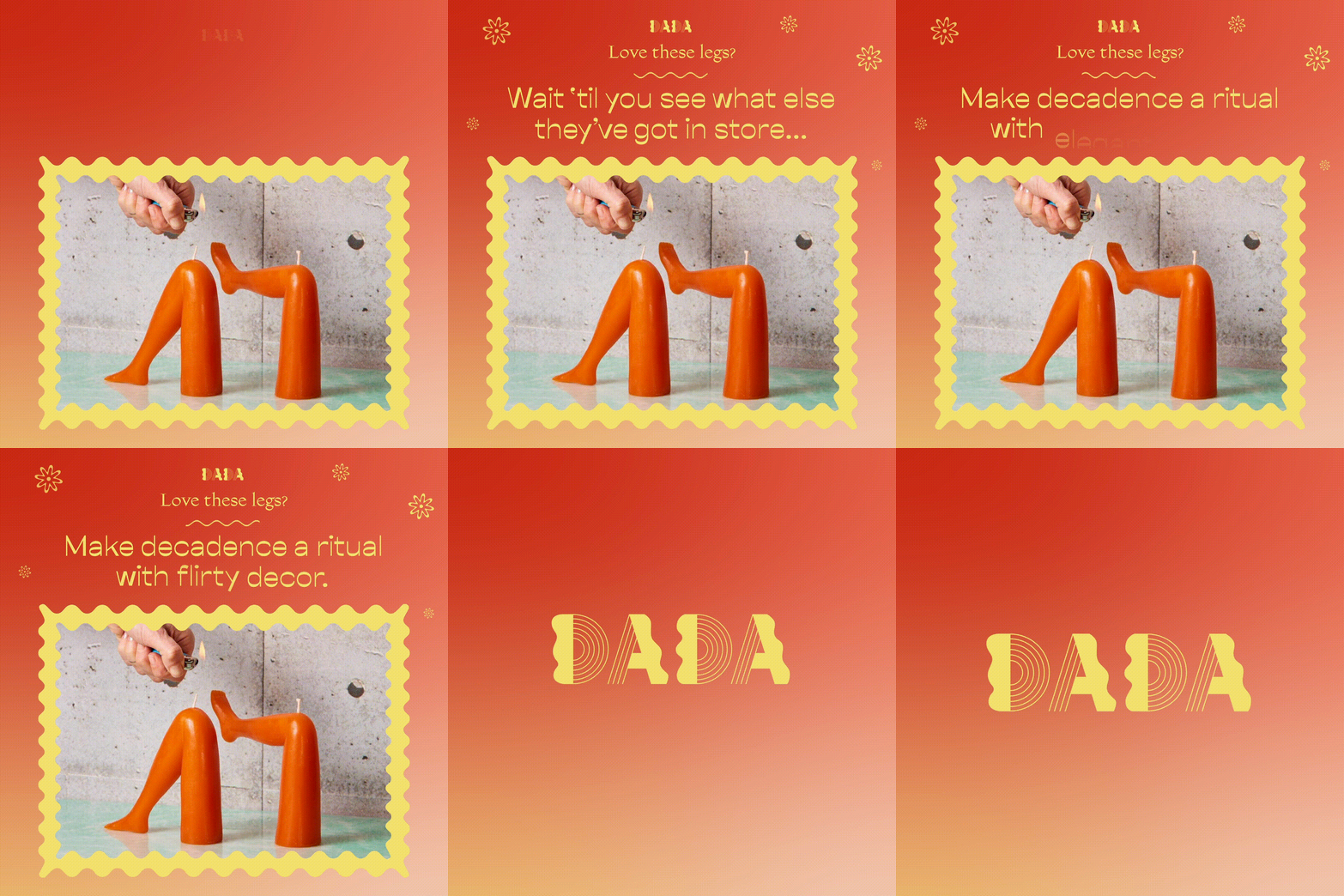
By A/B testing various target personas and creative strategies against each other, we provided valuable insights to the brand about their customer. I designed many different ads that aimed to figure out which persona would resonate more with these specific products and the lifestyle they're trying to sell.
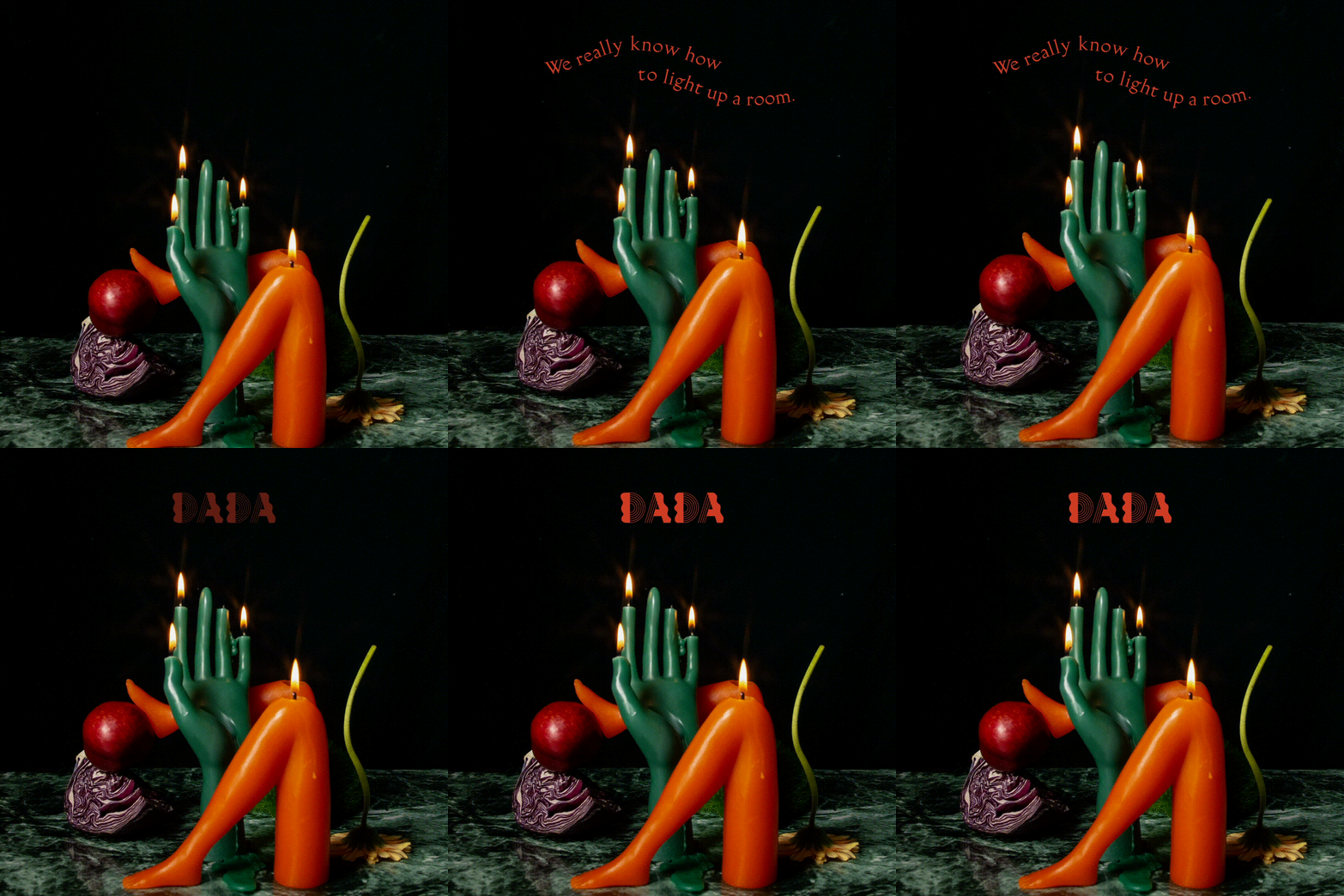
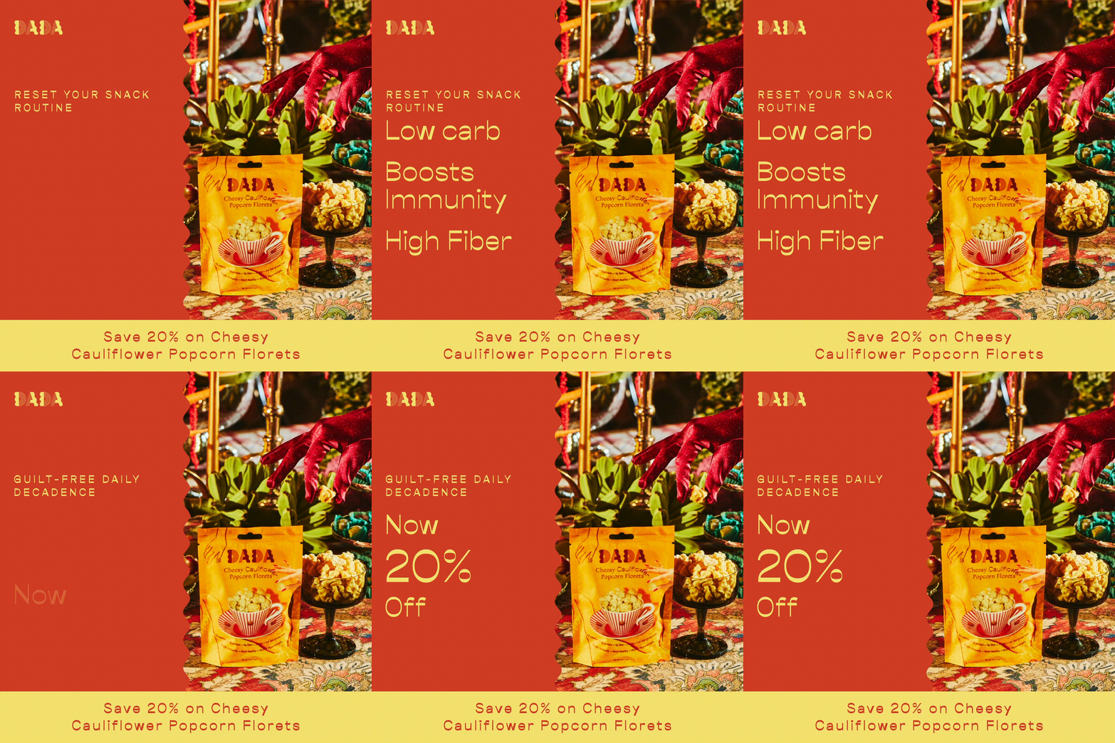
Using these innovative analyses and a cross-platform, comprehensive lifecycle marketing strategy, we isolated their top audiences and increased their average order value throughout 2020 by 62%.
A common practice at Superbolt is to come up with iterations on top-performing designs and messaging. Here, we heavily focused on deriving demographic and creative learnings based on the data we collected.
Digital marketing design for Dada Daily,
with Superbolt Agency 2020/2021
Social Studies makes party planning simple by providing complete rentable tablescapes.
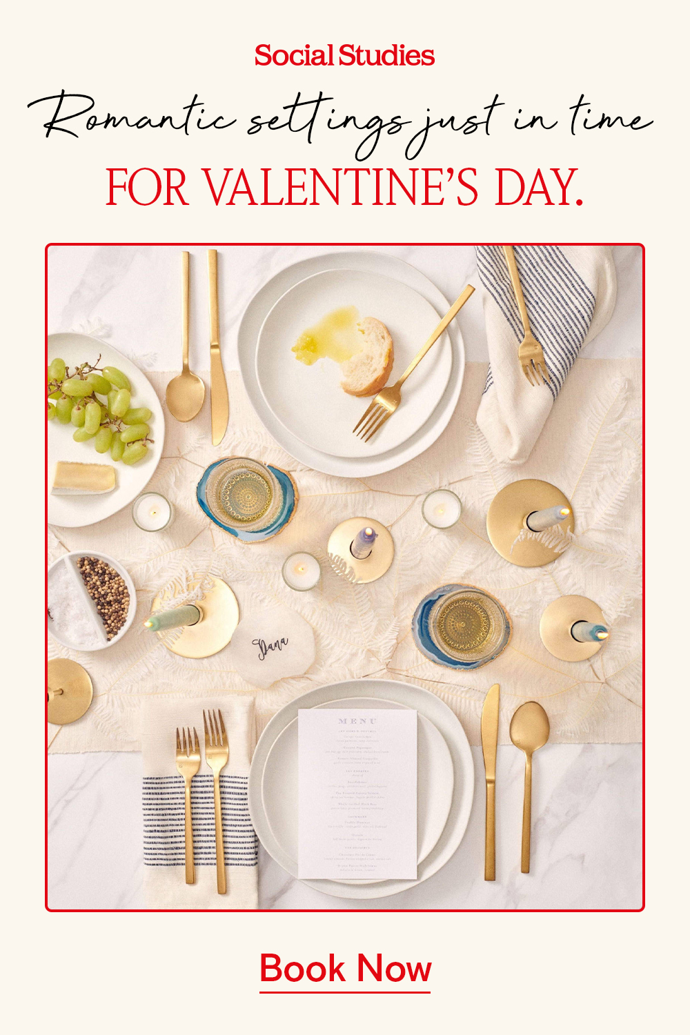
I worked closely with the Superbolt team of marketers, data scientists, and copywriters to strategize and execute these promotional campaigns.
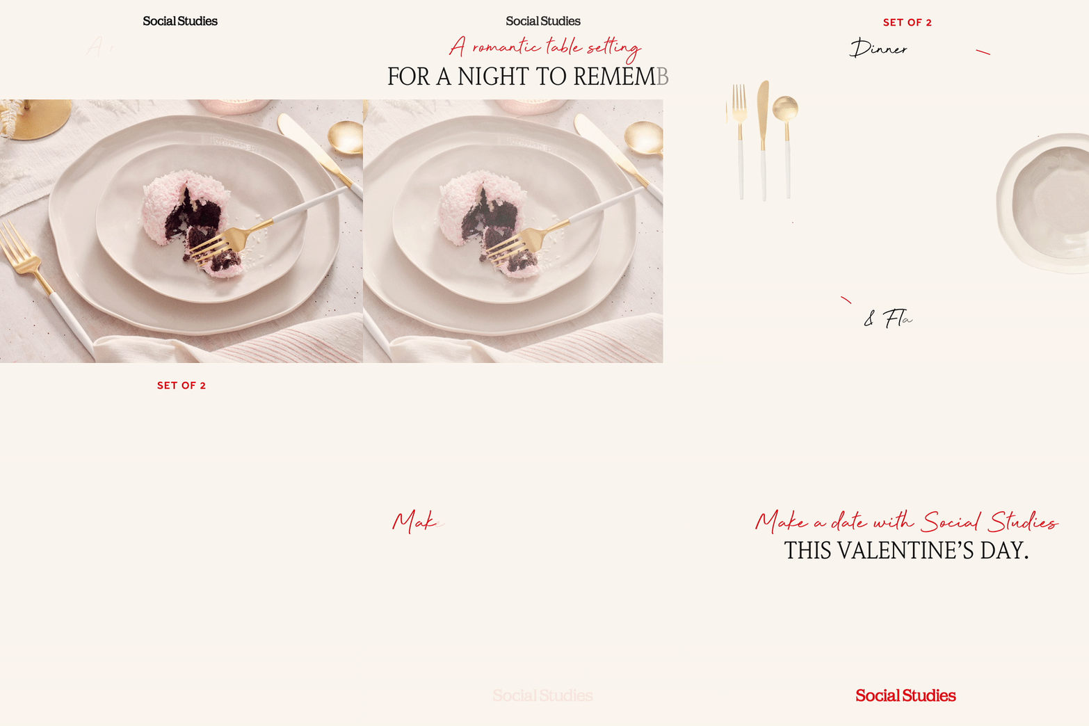
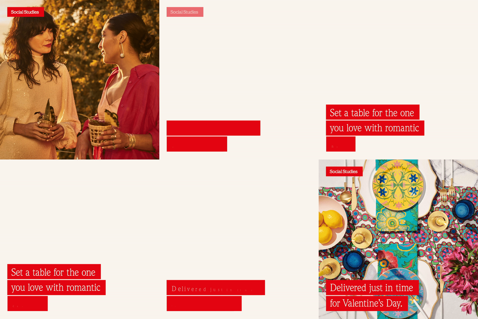
We successfully scaled the brand throughout Covid. We increased the revenue by 13x from January to December in 2020. We targeted audiences in urban and southern areas. As well as people who interacted with emails. I used Social Studies’s existing brand to create still and motion social media ads and emails.
Emails are a smart platform for organizing information. I had the opportunity to build email templates from scratch. I used my knowledge of email design and branding to create a cohesive email template that prompts users to buy their products.




Digital marketing design for Social Studies
with Superbolt 2020/2021
The Francis Aud Brand Identity


Who is Francis Aud?
Francis Aud is a local NYC musician and singer song writer who was looking to create a cohesive visual identity and art direction. The genre is funk meets pop, which you can hear him performing live alongside his 7-piece band.
The brand direction
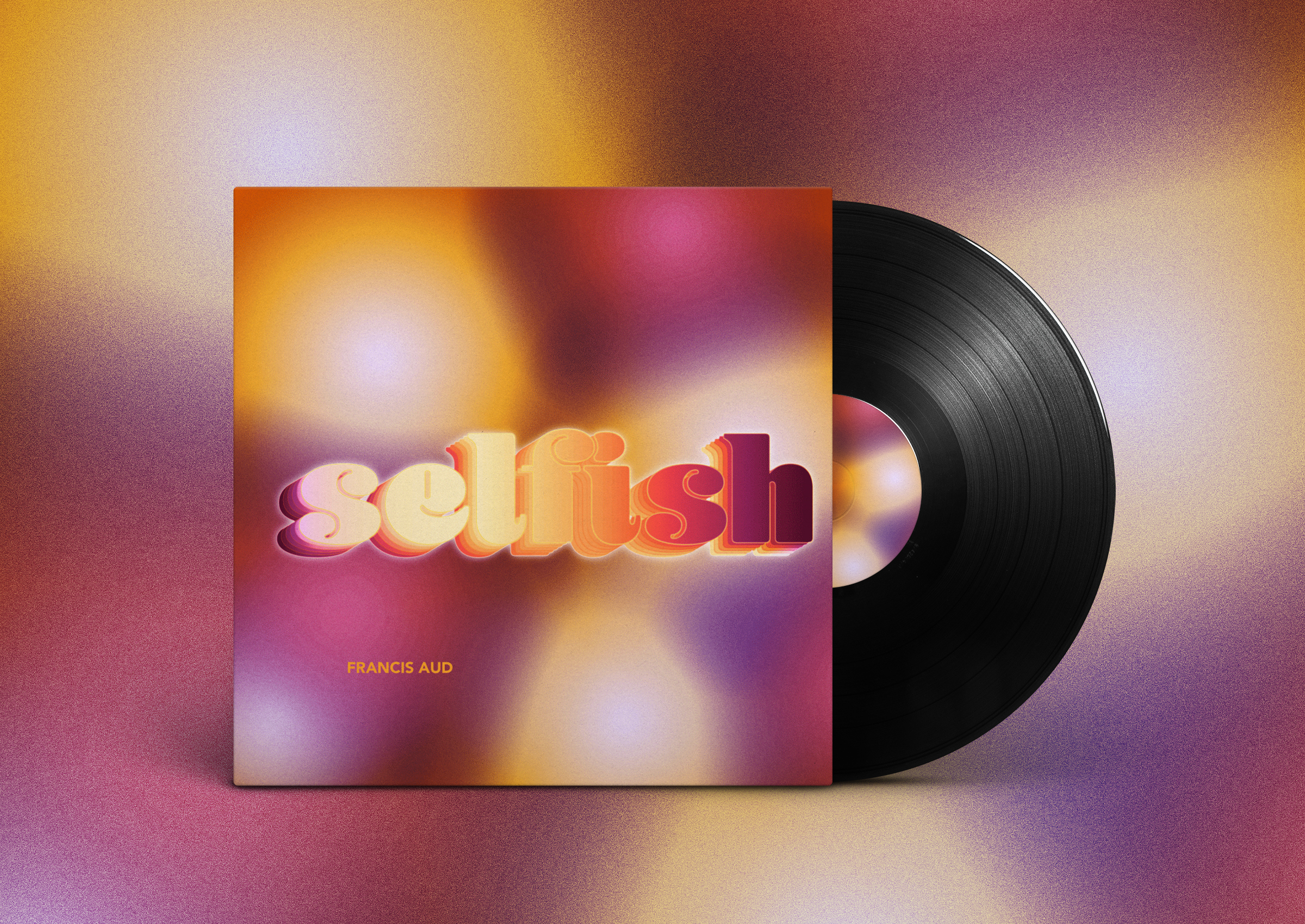
The visual identity reflects the style of music, it’s bright and dynamic. The logo uses the Blenny Black font, making us nostalgic of the 70’s, and is echoed as sound sometimes does. The rest of the visuals followed a similar logic. The big text is always loud and is complimented by vibrant colors. It was decided that gradients would be a main element since they offer a variety of color combinations. It also mimics the stage during a concert. Textures and glow always act as almost tangible finishing touches to all elements of any design.
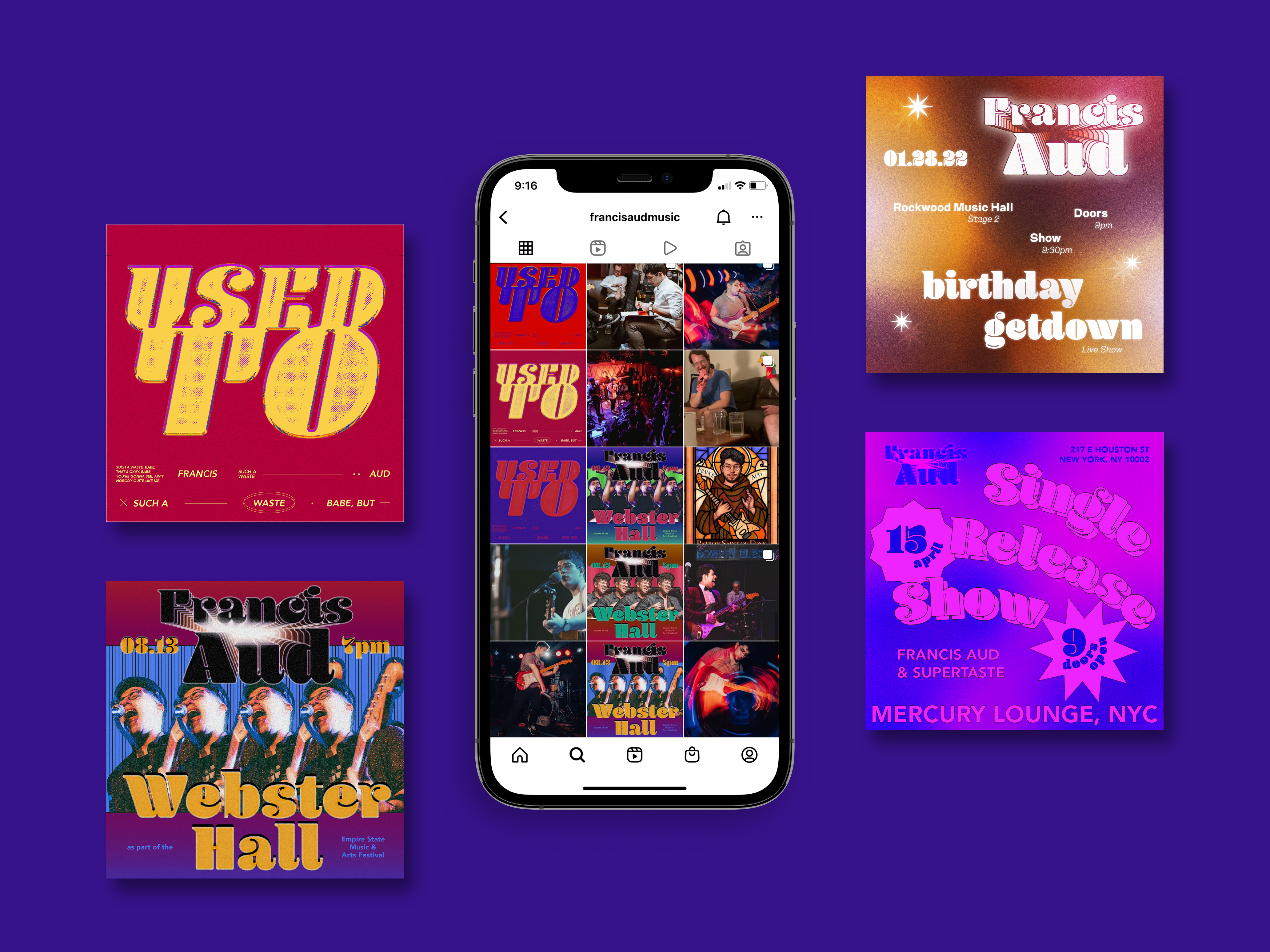
My design approach is inspired by my collaboration with the artist. Both his music and his personality helped me understand how the visuals should be matched.
The result, a cohesive brand with a large spectrum and options.
The result, a cohesive brand with a large spectrum and options.
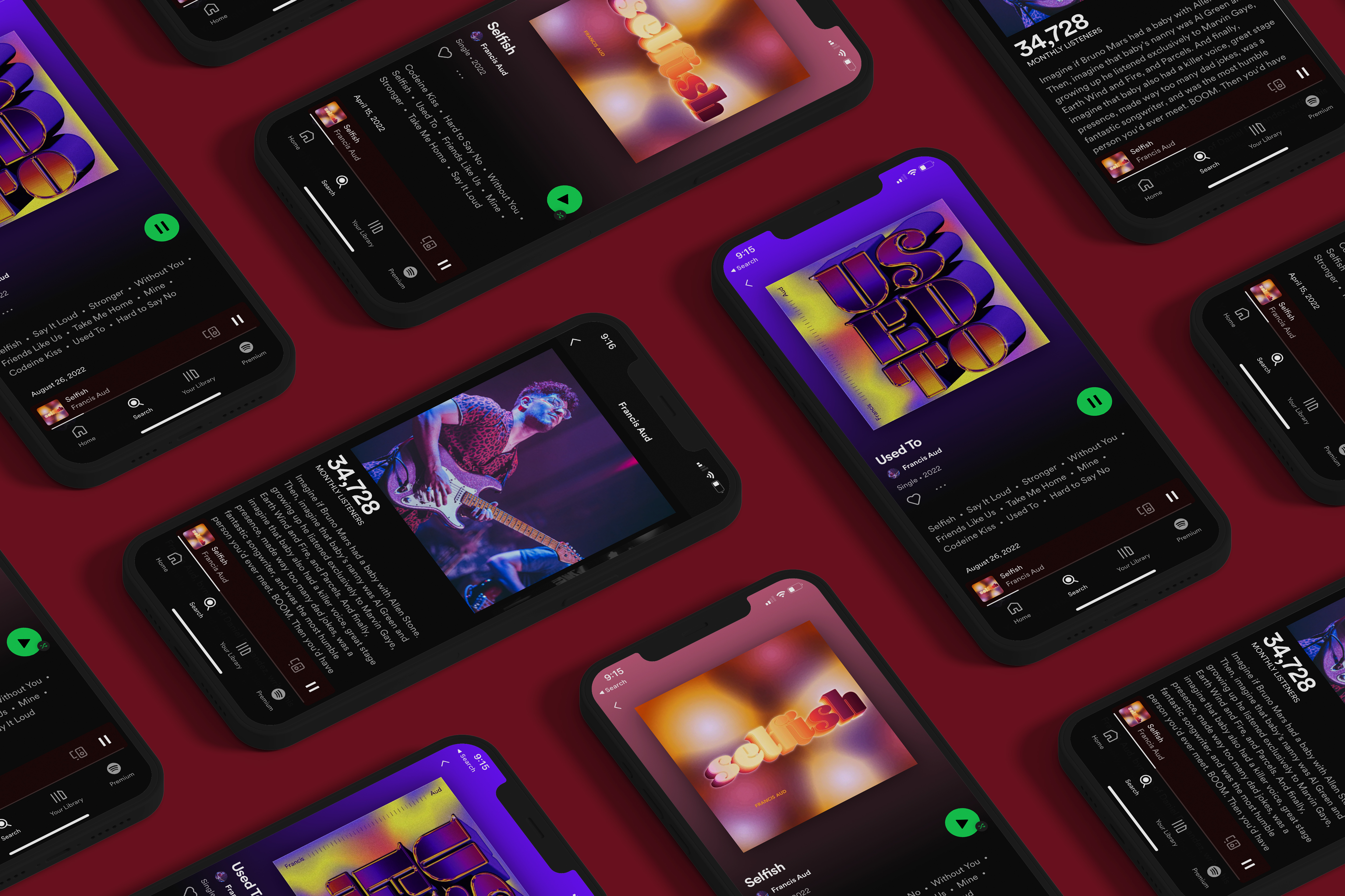
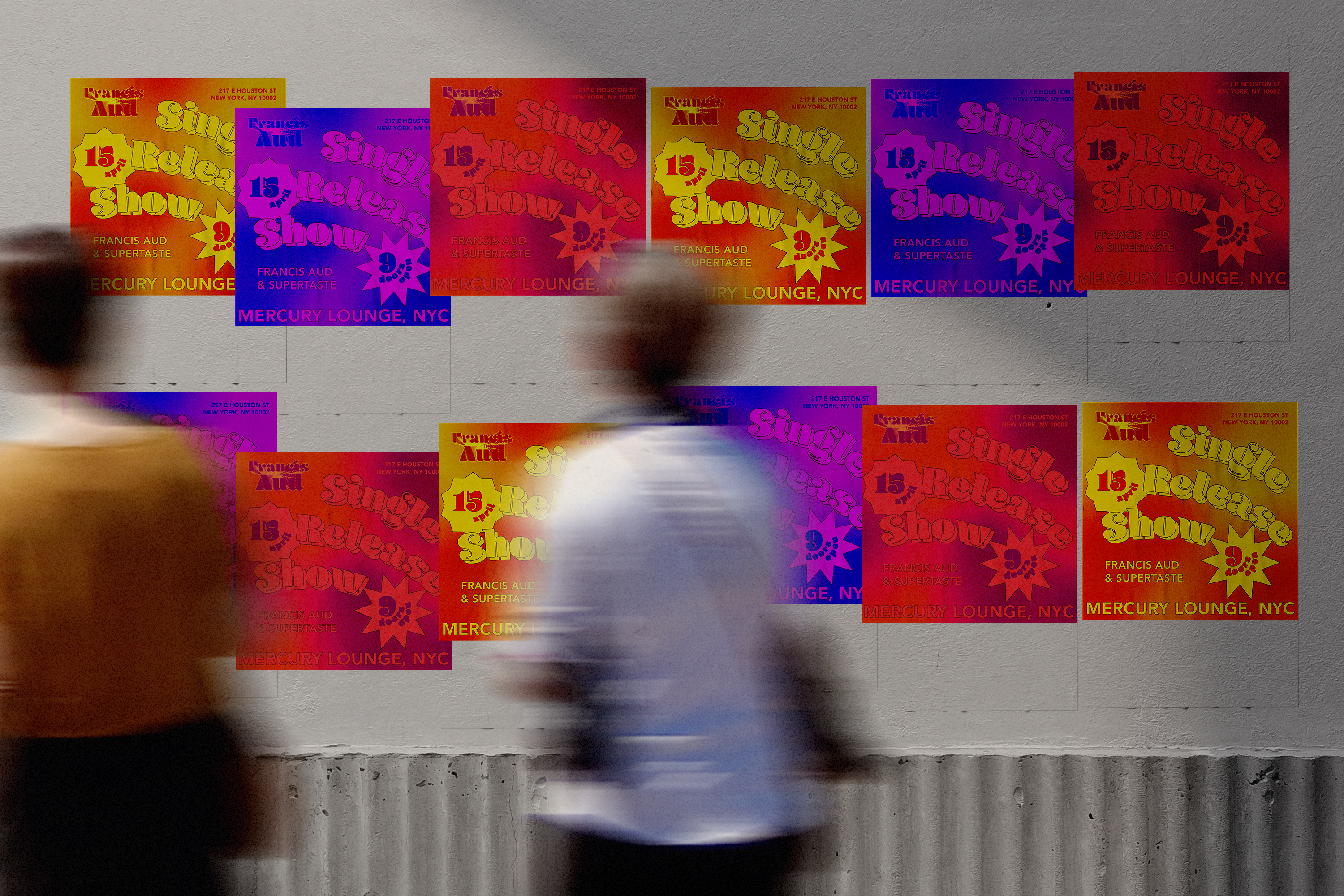

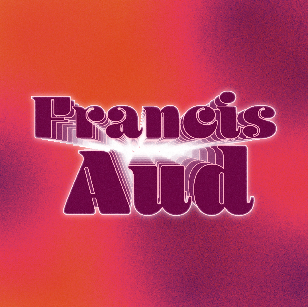


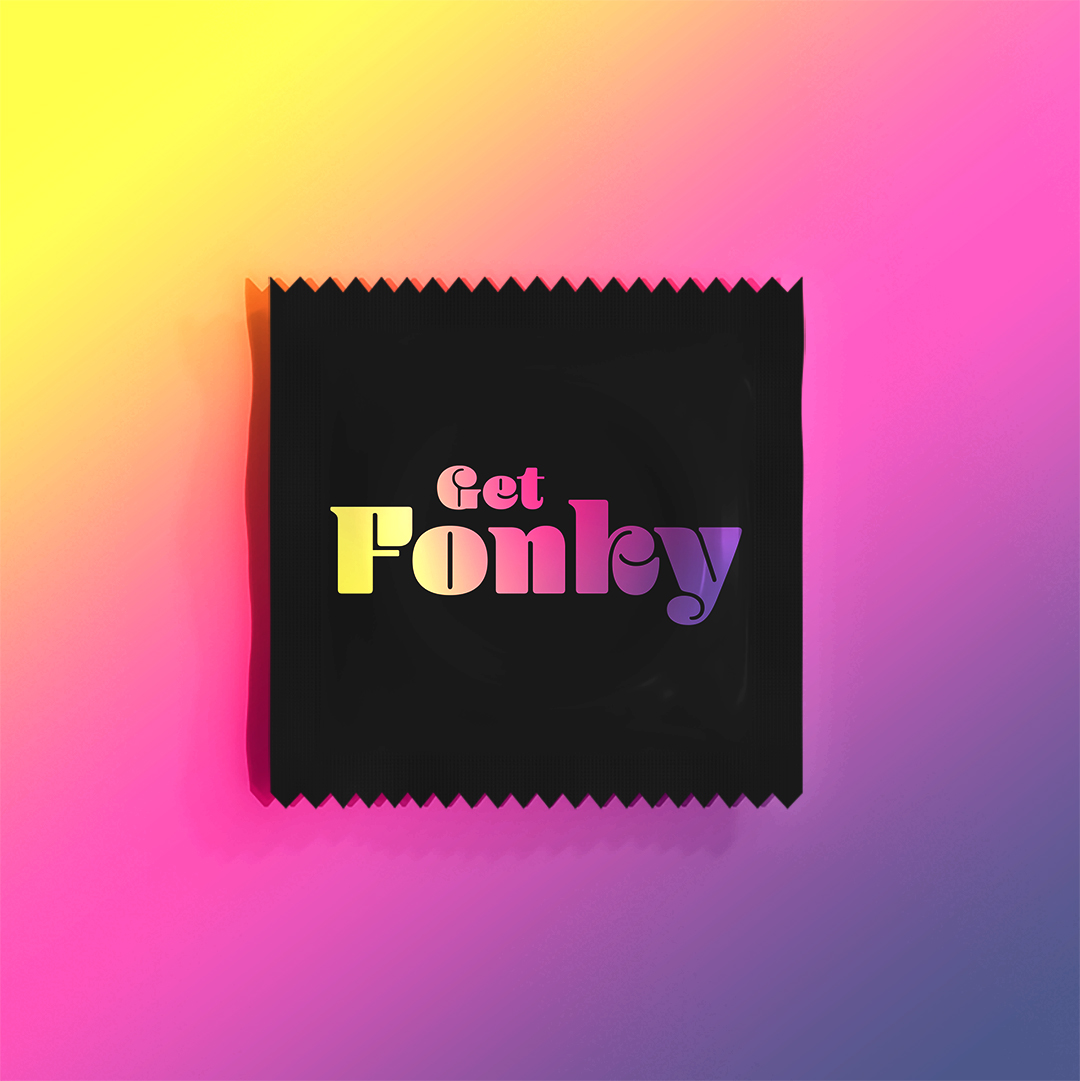


Branding Identity and Visual System for musician, Francis Aud
2021/2022
Type Thursday Yerevan
Type Thursday is a monthly type design event that creates a friendly environment for designers to connect and nerd out on type.
With a local graphic designer, Araz Bogharian, we launched a Type Thursday chapter in Armenia—the 16th chapter.
As the editorial lead, I design the social media content using the existing brand to come up with different promotional content to go on social media. Type Thursday has a brand. They require us to pick one gradient that belongs to our city.
The event’s goal is to bring the design community together. It's especially impactful in Yerevan because there are not many design events or creative hubs here.
Since Type Thursday is worldwide, it shines a light on local designers in a part of the world that isn't as known. It’s an opportunity to push design thinking, something that’s missing in a lot of places, including Armenia.
Type Thursday Yerevan provides the space necessary to foster and grow that design community while elevating it.

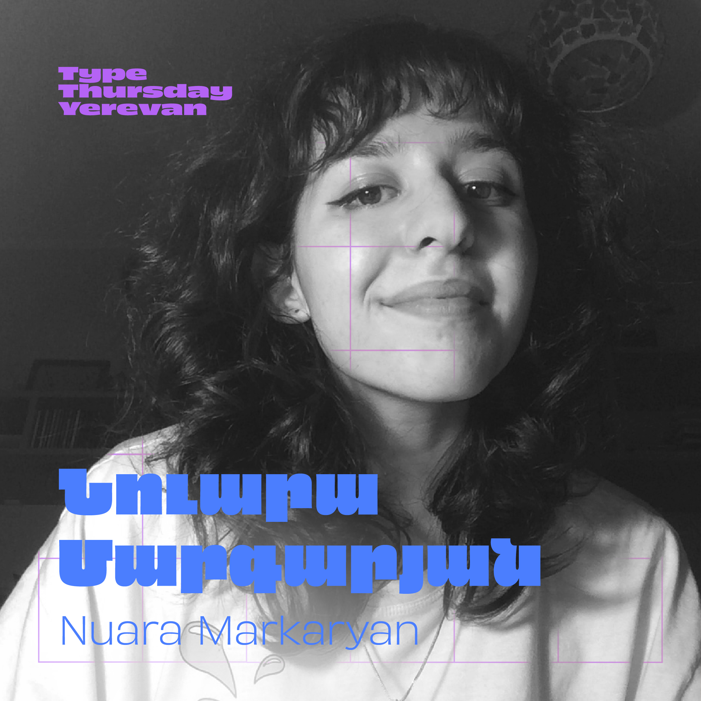


Social Media Posts, Type Thursday Yerevan 2021/2022